Unsolicited concept, not a paid client
Fairlo: a Swedish credit company’s website, redesigned so the price comes first
An unsolicited concept for a real Swedish credit company. Same product, same prices, same legal text, rebuilt so a visitor sees what the credit costs before they apply. Fairlo didn’t commission this, and there are no invented results.
- Type
- Unsolicited concept, not a paid client
- Brand
- Fairlo (real company, not a client)
- Scope
- Content and pricing audit of the public site, redesign of the homepage, a pricing page and the apply entry, build in static HTML/CSS/JS
- Built with
- HTML, CSS and vanilla JavaScript, with one pricing data file that feeds every number on every page
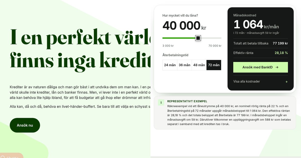
The starting point
Fairlo is a Stockholm fintech that offers a kontokredit (a revolving credit line) of up to 70 000 kr. The credit itself is provided by Bankaktiebolaget Nordiska. Fairlo’s whole pitch is fairness: the same interest rate for everyone, no hidden fees, a B Corp certification, and a “Fairnesskvitto” (fairness receipt) that shows what each transaction costs and what Fairlo makes on it.
It’s a well-built site with a distinctive brand voice. On desktop, Lighthouse gives it 99 for performance. So this isn’t a story about a broken website. It’s about a site whose promise (“you always know what it costs”) is stronger than the way it shows the price.
To be clear up front: this is an unsolicited concept. Fairlo didn’t commission it and isn’t a client. I haven’t seen their analytics or conversion numbers, so there are no before-and-after results. Every price, fee, rate and legal sentence in the redesign is copied word for word from fairlo.se as of 30 October 2026. I didn’t invent any numbers, reviews or quotes. Any real version would need Fairlo’s own compliance team to approve the wording.
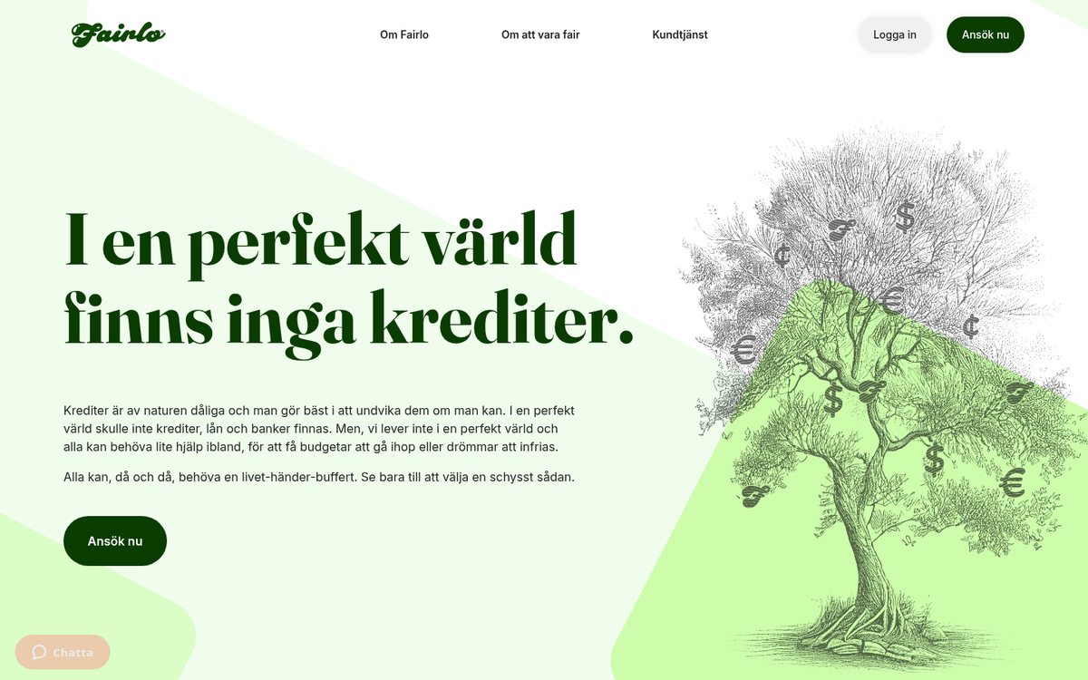
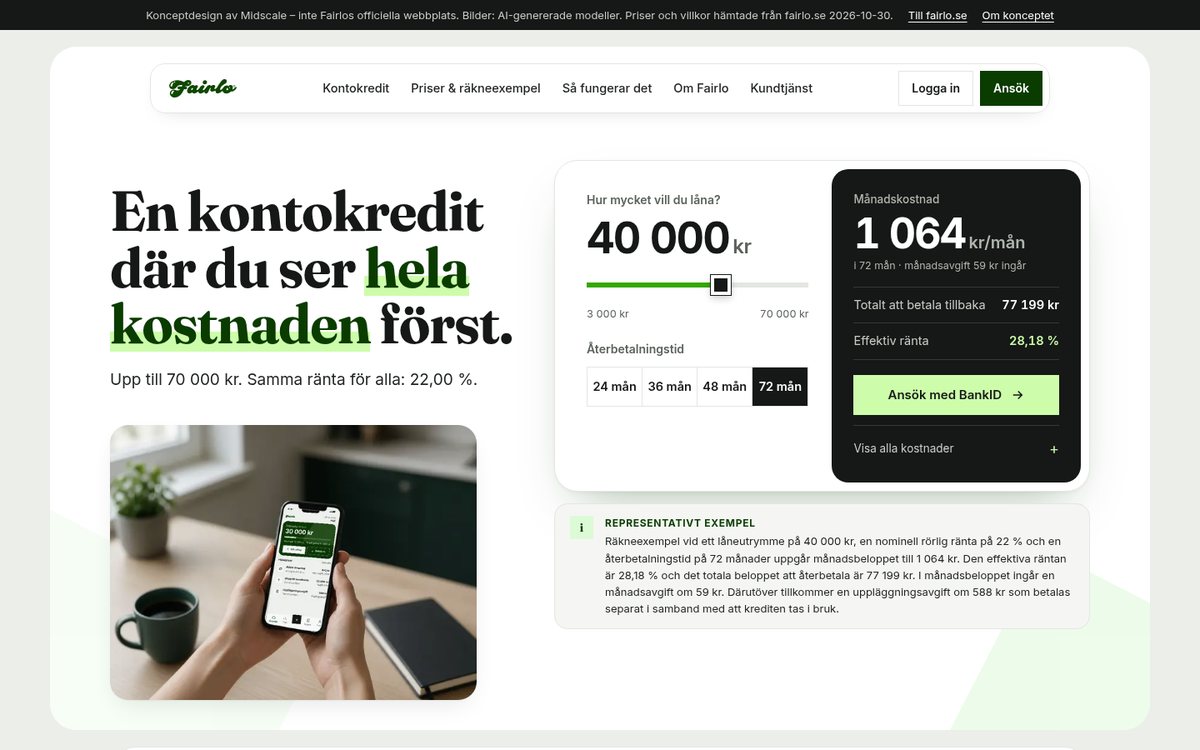
The live homepage today and the concept. The person holding the phone is an AI-generated model, not a customer.
What I found
I read the homepage, the product pages, the price calculator, the FAQ, customer service, the SEKKI (the standard EU credit information form), the terms and the apply entry, on desktop and on a phone. Here’s what a visitor runs into, and what the concept does instead.
1. The first screen doesn’t say what the product is
Before: The homepage opens with “I en perfekt värld finns inga krediter.” and a paragraph explaining that credit is bad by nature. It’s honest and very on-brand. But there’s no product name, amount or price on the first screen, on desktop or on a phone. The word “kontokredit” first appears further down.
After: The headline names the product and the promise: “En kontokredit där du ser hela kostnaden först.” One short line says “Upp till 70 000 kr. Samma ränta för alla: 22,00 %.” Then comes the calculator. Fairlo’s own line about the perfect world is still on the page, further down, where it reads as a value rather than a hurdle.
2. The interest rate is stated four different ways
Before: The product pages say “20-22% ränta per år”. Customer service says “22,00 %”. The FAQ says “Upp till 22%”. The SEKKI says 22,00 %. The monthly fee is “upp till 59 kr” in one place, “59 kronor per varje månad som kreditutrymmet är nyttjat” in another, and “0 kr” in the calculator. The setup fee is a flat 588 kr on one page and 299, 499 or 588 kr depending on the limit in the SEKKI.
After: One pricing data file holds the rate, every fee and the representative example. The calculator, the price page, the apply page and the footer all read from it, so the numbers can’t drift apart again. I used the SEKKI as the source and flagged every other version for Fairlo to confirm. I didn’t pick one silently.
3. The only calculator is halfway down a sub-page
Before: Fairlo has a good calculator, but it sits about halfway down the “låna 10 000 kr” pages. It rounds the effective rate to “29 %”, while the representative example in the footer of the same page says 28,18 %. It also leaves out the monthly fee.
After: The calculator is in the hero, with the same amounts and terms as Fairlo’s own (3 000–70 000 kr, 24 to 72 months). It shows the monthly cost including the 59 kr monthly fee, the total to pay back and the effective rate to two decimals. The rest (nominal rate, setup fee, total credit cost) is one tap away under “Visa alla kostnader”. At the default of 40 000 kr over 72 months it shows 1 064 kr, 77 199 kr and 28,18 %, exactly the representative example. The build checks that every time it runs.
4. The representative example is fine print in the footer
Before: The legally required example is in small white text on dark green at the very bottom of every page. On the mobile homepage it sits about 94 % of the way down.
After: The full example, word for word, sits directly under the calculator, where people decide. The “Att låna kostar pengar!” warning follows right after, with its icon and the link to konsumentverket.se.
5. Applying takes an extra page, and the price isn’t on it
Before: “Ansök nu” leads to a second sales page with four bullets, review widgets and another “Ansök nu”. The rate and the example are behind a small grey link. The requirements (BankID, an income of at least 120 000 kr a year, no debt with Kronofogden) are only in the FAQ.
After: The concept’s apply page is one step to BankID. It shows “Det här behöver du” (the real requirements), the visitor’s own calculation carried over from the calculator, the example and the warning, and one button: “Starta ansökan med Mobilt BankID”.
6. On a phone, the offer is hidden and the page is slow
Before: On a phone, the first screen is the headline, the paragraph about credit being bad and a button. Four of the five benefits are hidden in a sideways carousel, and the chat button overlaps the content. In my one Lighthouse run (simulated mobile, 29 October 2026), the homepage scored 49 for performance, with the main headline appearing after 14.4 seconds. Most of the delay came from about ten third-party scripts for chat, tag management and ad tracking.
After: The phone layout stacks the headline, the one-line offer and the calculator, and after the hero a sticky bar keeps the monthly cost and “Ansök med BankID” in view. The benefits are a list, not a carousel. The concept loads no third-party scripts at all.
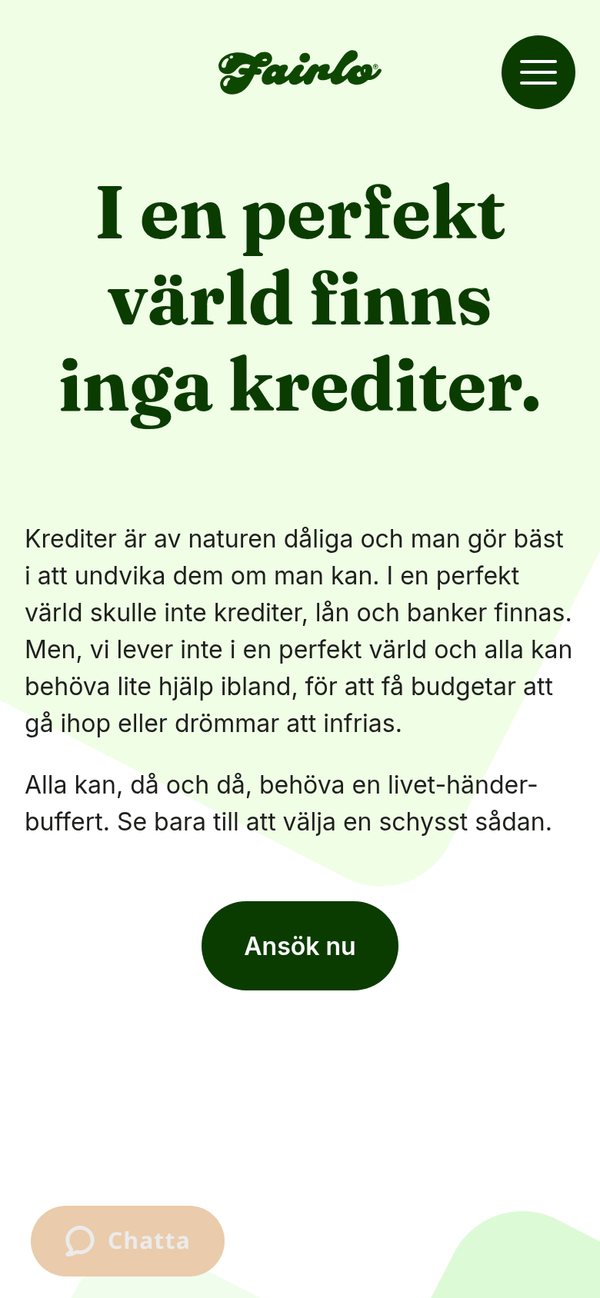
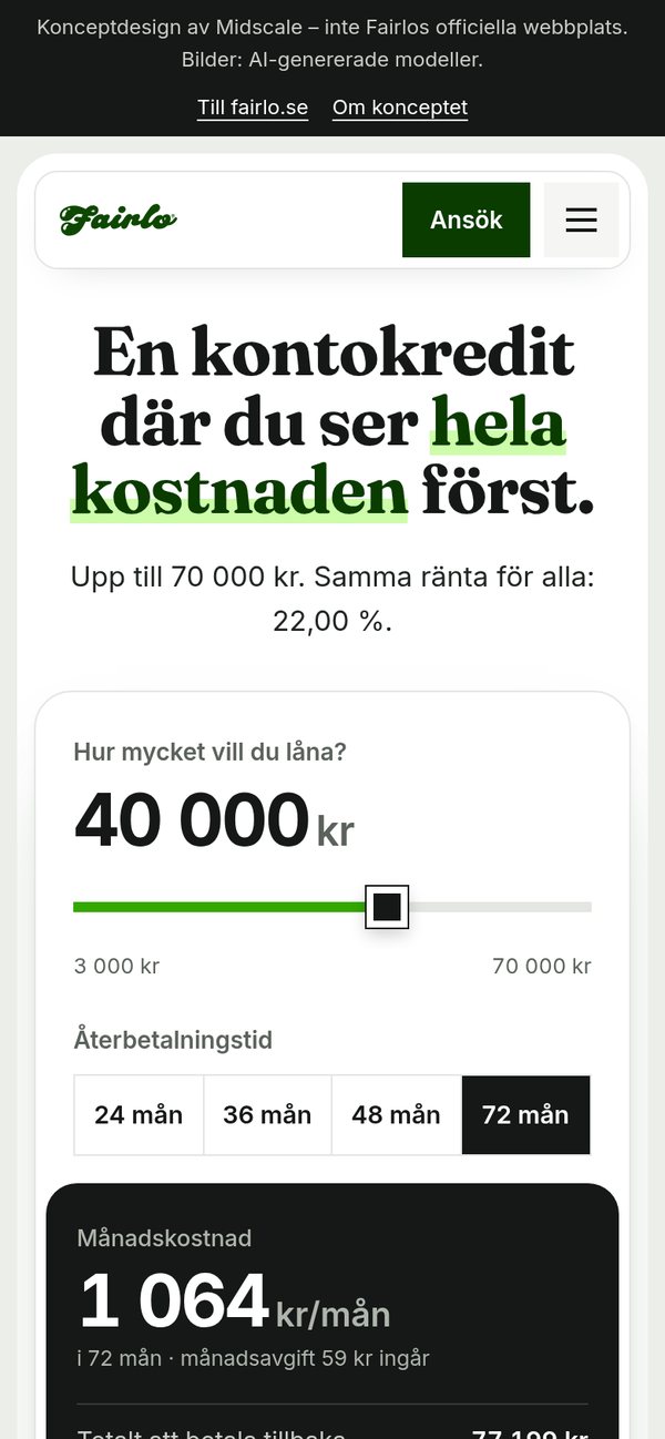
First screen on a phone: before and after.
Key design decisions
The price is the hero
For a credit product, the price is the decision. So the first screen has a clear order: the headline, one short line, then the calculator with a single button, “Ansök med BankID”. The result panel stays calm: the monthly cost, the total and the effective rate. Everything else is there, but behind “Visa alla kostnader” so it doesn’t compete.
The Fairnesskvitto, shown instead of described
Fairlo says it’s “först i världen med ett rättvisekvitto”, but the website only describes the receipt in words. The concept draws it: a receipt for the representative example that splits the 77 199 kr into the amount borrowed, interest, monthly fees and the setup fee, as a bar and a list. It follows the calculator, so it changes when the amount does. Fairlo’s real receipt also shows their own costs and margin. I don’t have those numbers, so the concept says where to find them instead of inventing them.
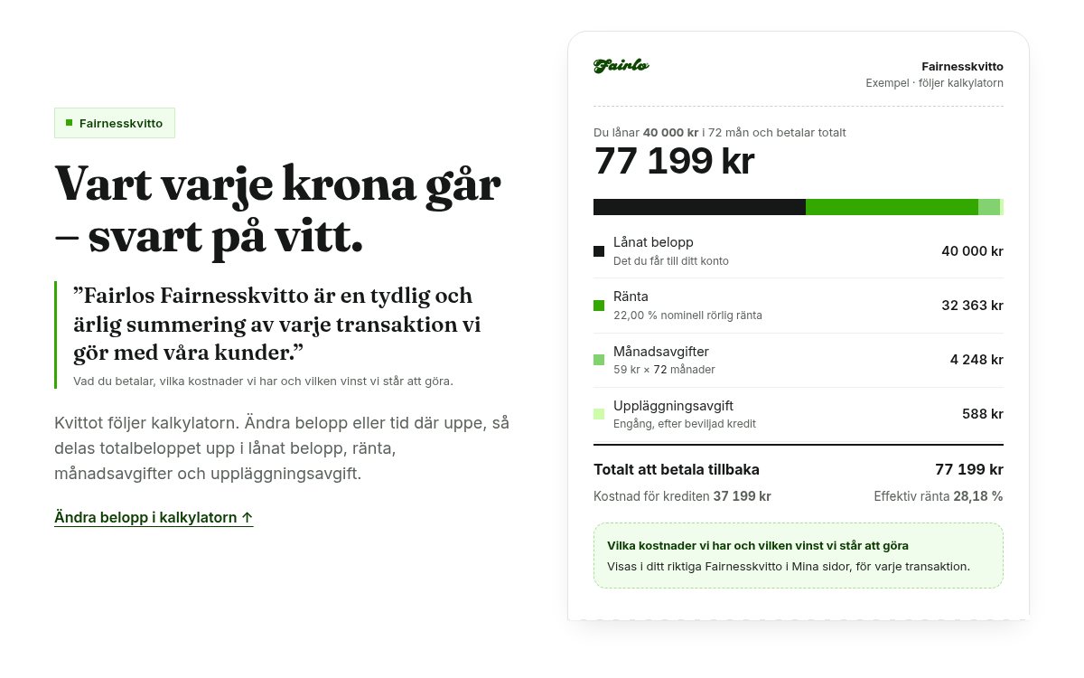
The receipt is built from the same pricing file as the calculator, so the two always agree.
One source for every number
Every price on every page comes from one data file. The same calculation code runs in the browser and in the build, and the build stops if the calculator doesn’t reproduce Fairlo’s representative example exactly. If Fairlo changes a fee, it changes everywhere at once.
People, motion and a calm tone
The concept uses photos of everyday Swedish adults in calm moments, one of them holding a phone with the account overview on screen. There’s no cash, no luxury and no “treat yourself”. The people are AI-generated models, and the page says so in three places. They’re never paired with a quote or a review, because they aren’t customers.
As you scroll, headings sharpen from a soft blur, the kitchen photo eases into focus behind a frosted caption, connector lines flow between the “same rate for everyone” tiles, and the 22,00 % counts up. None of it hides or delays the calculator, the button or the legal text. Anyone who has turned on “reduce motion” gets a still page.
Fast without the extras
The concept is plain HTML, CSS and a small amount of vanilla JavaScript, with no third-party scripts. I ran Lighthouse on it myself (version 12.8, three runs each, served from a plain local server without compression). The results were 93 on simulated mobile and 100 on desktop for performance, and 100 for accessibility and best practices. Total blocking time was 0 ms and layout shift was 0. That’s not a like-for-like comparison with the live site, which has chat, analytics and consent tools to carry, but it shows how much room there is.
The full concept, liveOpen the full Fairlo conceptA homepage, a price page and an apply page, built from Fairlo’s own content. Try the calculator: every number comes from one source.Open the concept site →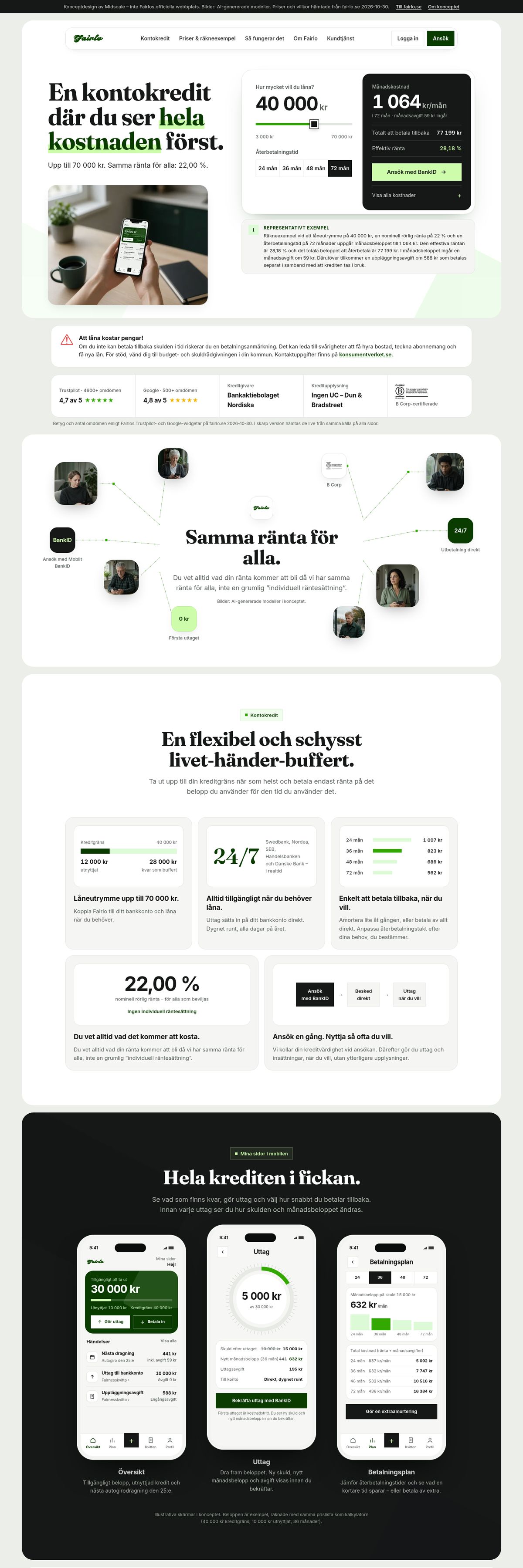
You can also open it directly: midscalemedia.com/work/fairlo/site/
What I’d hand Fairlo
If Fairlo wanted to use this, I’d send three things along with the design:
- A list of questions to confirm. These are the contradictions I found and didn’t guess at: the “20-22%” rate on the product pages against 22,00 % in the SEKKI, the two wordings of the example (setup fee inside the monthly amount, or paid separately), whether the calculator should include the 59 kr monthly fee, the tiered setup fee, and the three different review counts.
- A request for a real Fairnesskvitto. The concept shows the customer’s side of the receipt. To show Fairlo’s costs and margin the way the real one does, I’d need a sample with the actual fields.
- The compliance check. Every legal text is quoted word for word, but placement and wording on a credit site belong to Fairlo’s compliance team. That includes how the calculator presents small limits, where the effective rate gets high, and whether any extra labelling is required.