Unsolicited concept, not a paid client
Ramstenkliniken: a real Södermalm dental clinic’s website, redesigned around booking
An unsolicited concept for a real Stockholm dental clinic. Same content, same prices, same people, rebuilt so a nervous patient on a phone can find a time, a price and a phone number in seconds. The clinic didn’t commission this, and there are no invented results.
- Type
- Unsolicited concept, not a paid client
- Brand
- Ramstenkliniken (real clinic, not a client)
- Scope
- Content audit of every page, redesign of the full site as one page, build in static HTML/CSS/JS
- Built with
- HTML, CSS and vanilla JavaScript, with a scroll-scrubbed image sequence for the hero
The starting point
Ramstenkliniken is a small dental clinic on Högbergsgatan, between Slussen and Medborgarplatsen on Södermalm. Two dentists, a dental hygienist and a receptionist. They take children under the free care scheme, they’re certified for Invisalign, and the copy says they’re used to caring for nervous patients.
The website doesn’t do them justice. Nobody asked me to look at it. I picked it because it’s a typical small-clinic site: built years ago by an agency, updated now and then, and never re-checked as a whole.
To be clear up front: this is an unsolicited concept. Ramstenkliniken didn’t commission it and isn’t a client. I haven’t seen their analytics or booking numbers, so there are no before-and-after results. Every word, price and name in the redesign comes from their current site. I didn’t invent anything.
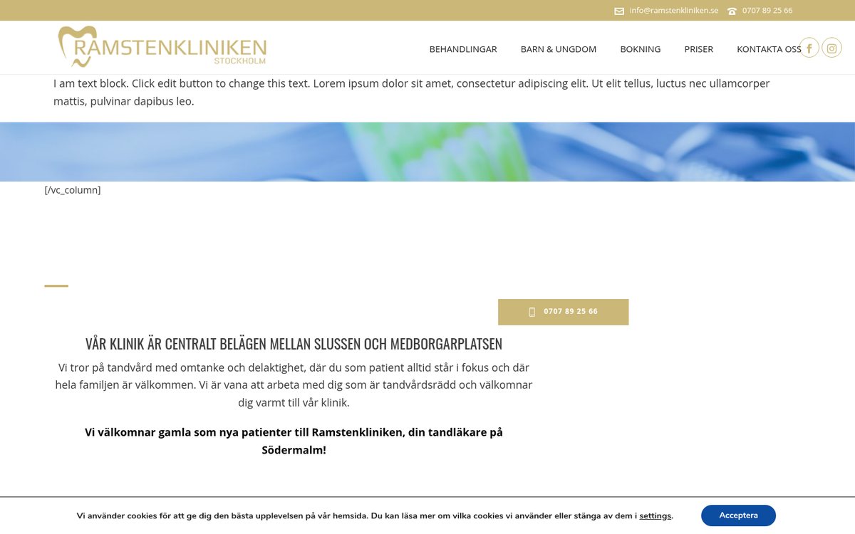
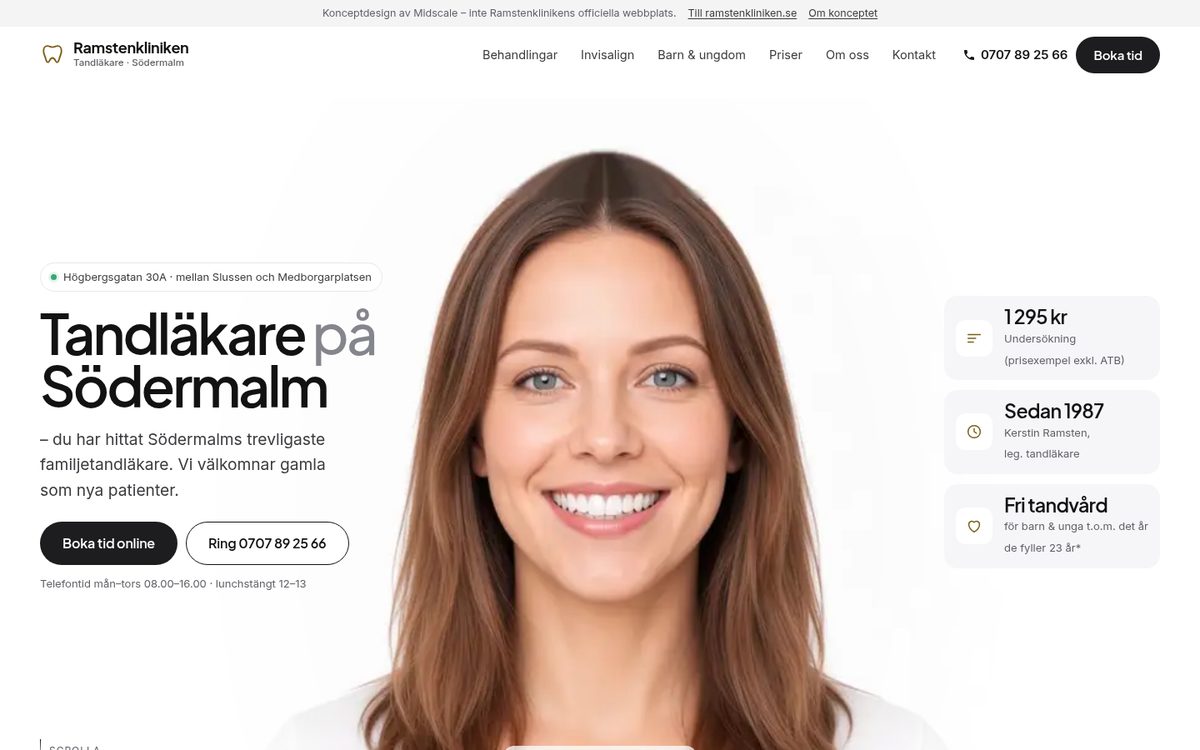
The live homepage today and the concept. The portrait is an AI-generated model, not a patient.
What I found
I read every page of the site: the homepage, treatments, Invisalign, children, booking, prices, contact, staff, partners, privacy and the leftovers. Here’s what a patient runs into, and what the concept does instead.
1. The first thing on the homepage is placeholder text
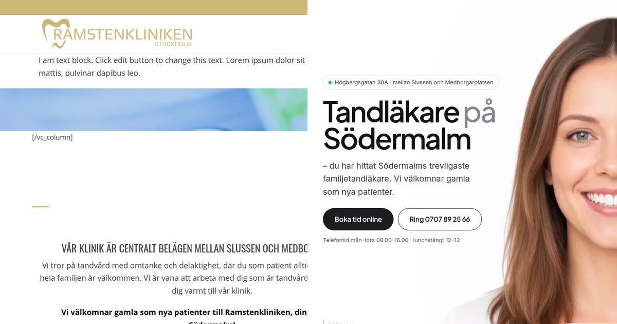
Before: Right under the logo, the homepage says “I am text block. Click edit button to change this text. Lorem ipsum dolor sit amet…”, followed by a stray [/vc_column] code. The real headline, “Tandläkare på Södermalm”, is in the code but not where a visitor looks. The same block also appears on one of the staff pages.
After: The first screen says who, what and where: “Tandläkare på Södermalm”, the address, the clinic’s own line “du har hittat Södermalms trevligaste familjetandläkare”, and two buttons, Boka tid online and Ring 0707 89 25 66.
2. Booking online exists, but it’s hidden
Before: The clinic uses Muntra for online booking, which is great. But on the homepage the only button you see first is the phone number. “Boka tid online” sits further down or on other pages.
After: Boka tid is in the header on every screen, in the hero, after the treatments, next to the prices and in the contact section. On a phone it’s in a bar at the bottom, next to Ring. Both use the real links.
3. The phone hours disagree with each other
Before: The booking page says the phones open at 08.00. The price and contact pages say 09.00. The staff page adds a Friday 08.00–13.00 that the contact page calls closed. A 2020 corona notice with “temporary” hours of 08.30–12.15 is still live.
After: One “Telefontid” block, using the booking page’s hours, which I’ve flagged for the clinic to confirm. I didn’t guess. Every contradiction I found is listed in the notes I’d send with the concept.
4. Prices are on three different pages
Before: The price list has six examples. The whitening price (3 500 kr) is only on the treatments page, and Invisalign (35 000 kr) only on its own page. Every treatment teaser on the homepage cuts off mid-sentence with “[..]”.
After: One clean price table with the six examples, the two extra prices clearly separated, and the notes that matter: prices exclude ATB, the clinic is connected to Försäkringskassan, payment by card or Swish, and the 24-hour cancellation rule. Treatment cards show their price next to the name, and the full text is one tap away.
5. Pinch-zoom is switched off
Before: The mobile viewport blocks zooming (user-scalable=0). For anyone who needs bigger text to read prices or opening hours, that’s a real accessibility problem.
After: Zoom works. Text has proper contrast, the headings are real headings, images have descriptions, and the page works with keyboard and screen readers. If someone has turned on “reduce motion” on their phone, the animation is switched off.
6. An old platform, with small errors left in
Before: The site runs on a 2021 WordPress version with a page-builder theme, and the favicon is from 2015. There are small slips like “implantant”, “estetiska tandvård” and “priserna är på ett ungefärliga”, the Invisalign plan is called “Clean-checken”, and three placeholder testimonials from 2015 are still published.
After: A light static build that loads fast. The obvious typos are fixed, and each fix is listed so the clinic can check it. The placeholder testimonials are gone. There are no reviews in the concept at all, because I won’t invent them.
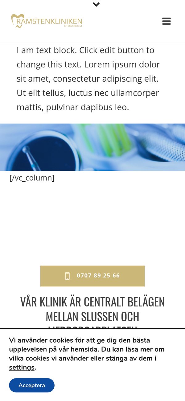
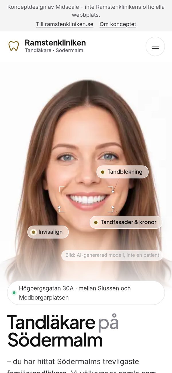
First screen on a phone: before and after.
Key design decisions
Booking first, everything else second
People visiting a dentist’s website want one of four things: book, call, check a price, or check they’re in the right place. So those four are on the first screen and repeated wherever someone might decide. Everything else (the treatment details, the Invisalign process, the team) supports that decision.
Calm, bright and clean
The layout takes cues from modern clinic design: a white page, soft grey and warm beige cards, large rounded corners and a big, clear headline. The accent colour is a deeper version of the clinic’s own gold logo, so it still feels like Ramstenkliniken.
A smile that moves as you scroll
The hero is a short clip of a smiling face that plays forward and back as you scroll. As it plays, small frosted labels appear next to the smile, naming three real treatments from the clinic’s site: Tandblekning, Tandfasader & kronor and Invisalign. Each label links to that treatment. The person is an AI-generated model, and the page says so. It isn’t a patient, and there’s no before-and-after promise.
Their words, not mine
The big statement in the middle of the page is the clinic’s own sentence: “Vi tror på tandvård med omtanke och delaktighet…”. It fills in word by word as you scroll. The three points under “Om kliniken” (modern dental care, nervous patients, fair prices) are their own homepage text, just given room.
Real people, handled with care
The team section uses the staff’s real names, titles and bios. It doesn’t use their photos, because they haven’t agreed to be in my portfolio. Each card has a marked spot for the clinic’s own photos if they ever want to use the design.
The full concept, liveOpen the full Ramstenkliniken conceptIt’s a single page with every section of their site. Scroll the hero to see the smile and the treatment labels.Open the concept site →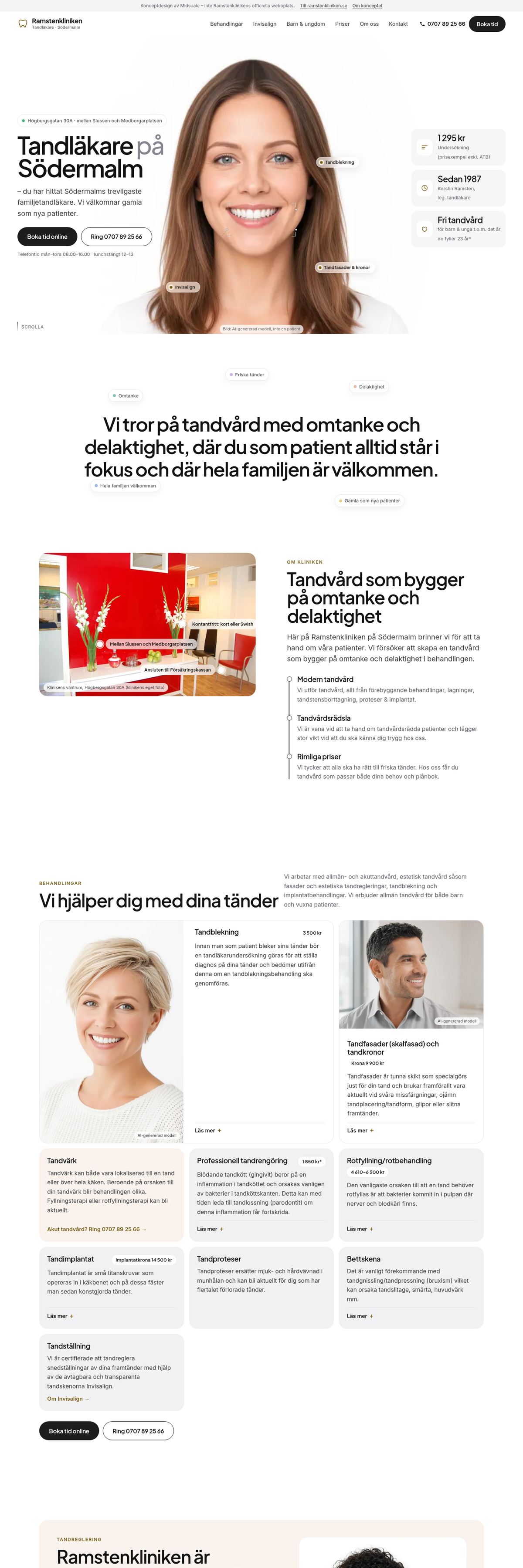
You can also open it directly: midscalemedia.com/work/ramstenkliniken/site/
What I’d hand the clinic
If Ramstenkliniken wanted to use this, I’d send three things along with the design:
- A list of questions to confirm. These are the contradictions I found and didn’t guess at: the phone hours, a second phone number that only appears on one page, whether children can book online, the age limit for free dental care (the site says both “3–19” and “up to 23”), and whether the whitening and Invisalign prices are still current.
- A list of gaps. The site doesn’t mention emergency hours, high-cost protection (högkostnadsskydd), Frikort, accessibility or parking. Patients look for these.
- The basics. A privacy policy that describes their real booking and contact data (today it’s the WordPress default text), working contact forms, and the old 2020 and 2015 pages removed.