Teardown: 8 fixes for an AI-built booking platform’s landing page
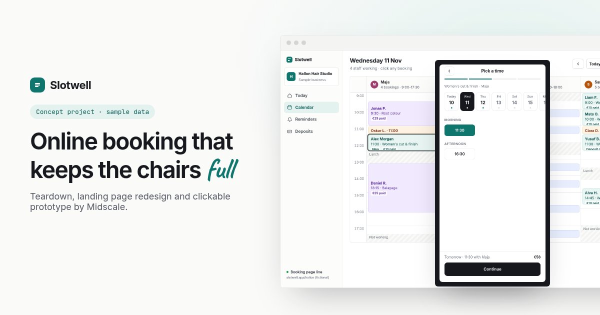
This AI-built booking platform has a working product behind the sign-in: a calendar, reminders, payments and a demo dashboard. The landing page hides almost all of it. Instead, it leads with a slogan and a row of big numbers that a careful buyer has no way to check.
I picked a real, live AI-built page, found eight things I’d fix, and redesigned it to show what fixing them looks like. If you built your app with Lovable, Bolt or Cursor, I’d bet at least three of these are on your page too.
A quick note on how this was made. Nobody hired me for this. It’s a self-initiated teardown of a public page, picked because it’s a typical AI-built SaaS site. I’ve blurred the brand and lightly reworded the copy so the company can’t be identified, and I haven’t seen their analytics, so there are no “conversion went up 40%” claims here. The “after” is a concept with a made-up name, Slotwell. I’m judging the page the way a salon owner seeing it for the first time would.
The page
It’s an online booking system for small businesses: salons, gyms, clinics, restaurants and professional services. Here’s the top of the homepage:
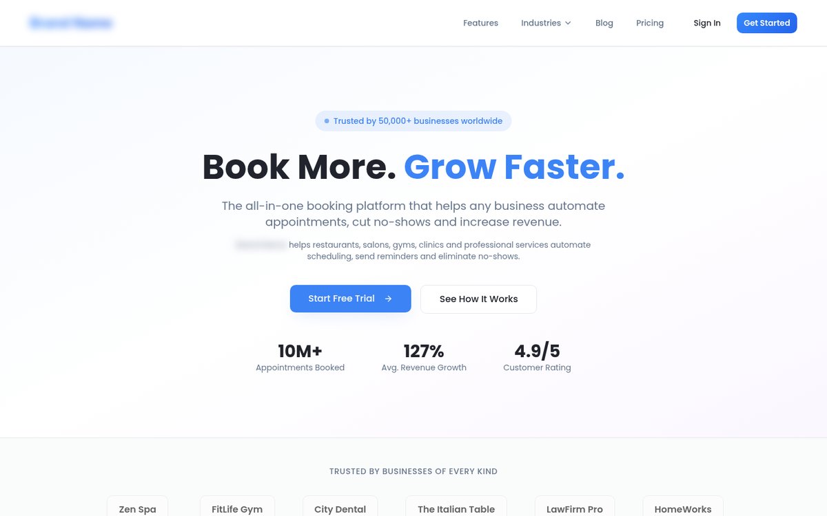
Before, desktop. Brand blurred, copy lightly reworded.
1. The headline could sell anything
“Book More. Grow Faster.” is a slogan, not a description. Swap the logo and it works for a CRM, an ad agency or a gym. The two paragraphs underneath then say nearly the same thing twice: an all-in-one booking platform that automates appointments, cuts no-shows and grows revenue.
The fix: say who it’s for and what it fixes, in words the buyer would use. The redesign leads with “Online booking that keeps your salon full”, with the business type rotating (barbershop, clinic, studio, gym), and one short paragraph explaining how: clients book and pay a small deposit from their phone, reminders go out on their own, and you see every chair in one calendar.
2. Big numbers with nothing behind them
The badge says the platform is trusted by 50,000+ businesses worldwide. The stats row adds 10M+ appointments booked, 127% average revenue growth and a 4.9/5 rating. None of them has a source, a date or a link. Further down, the same page says “join thousands of businesses”, and the whole site runs on a free subdomain of the app builder.
A careful buyer notices that. Once one number looks made up, they start doubting the rest of the page, including the parts that are true.
The fix: remove numbers you can’t back up. Keep the ones you can, with a source. If you’re early and don’t have numbers yet, that’s fine. Say something specific and true instead.
3. “Trusted by” names that aren’t logos
Under the hero, a “trusted by businesses of every kind” strip lists names like a spa, a gym, a dental practice and a law firm, each in a plain grey box. They read like placeholder names, not customers. The testimonials have the same problem: first name and initial only, no photo, no business, and specific results (one claims no-shows dropped by 60% in the first month) with nothing to check them against.
The fix: if you have real customers who agree to be named, show their real logos and full names. If not, leave the strip out. The redesign replaces it with a short list of the kinds of businesses the product is built for, with no claim attached.
4. No product on the page, and every button goes to sign-in
There isn’t a single screenshot of the product on the homepage. “Start Free Trial”, “Get Started” and “Sign In” all lead to the same sign-in screen. The site actually has a good demo dashboard on another page, but nothing on the homepage links to it.
For booking software, this is the biggest miss. The buyer wants to see two things: what their clients will tap through, and what their own calendar will look like.
The fix: put the product in the hero, and give the demo the main button. The redesign opens with a large preview of the team calendar and the client’s phone booking screen, and “Try the live demo” is the first button.
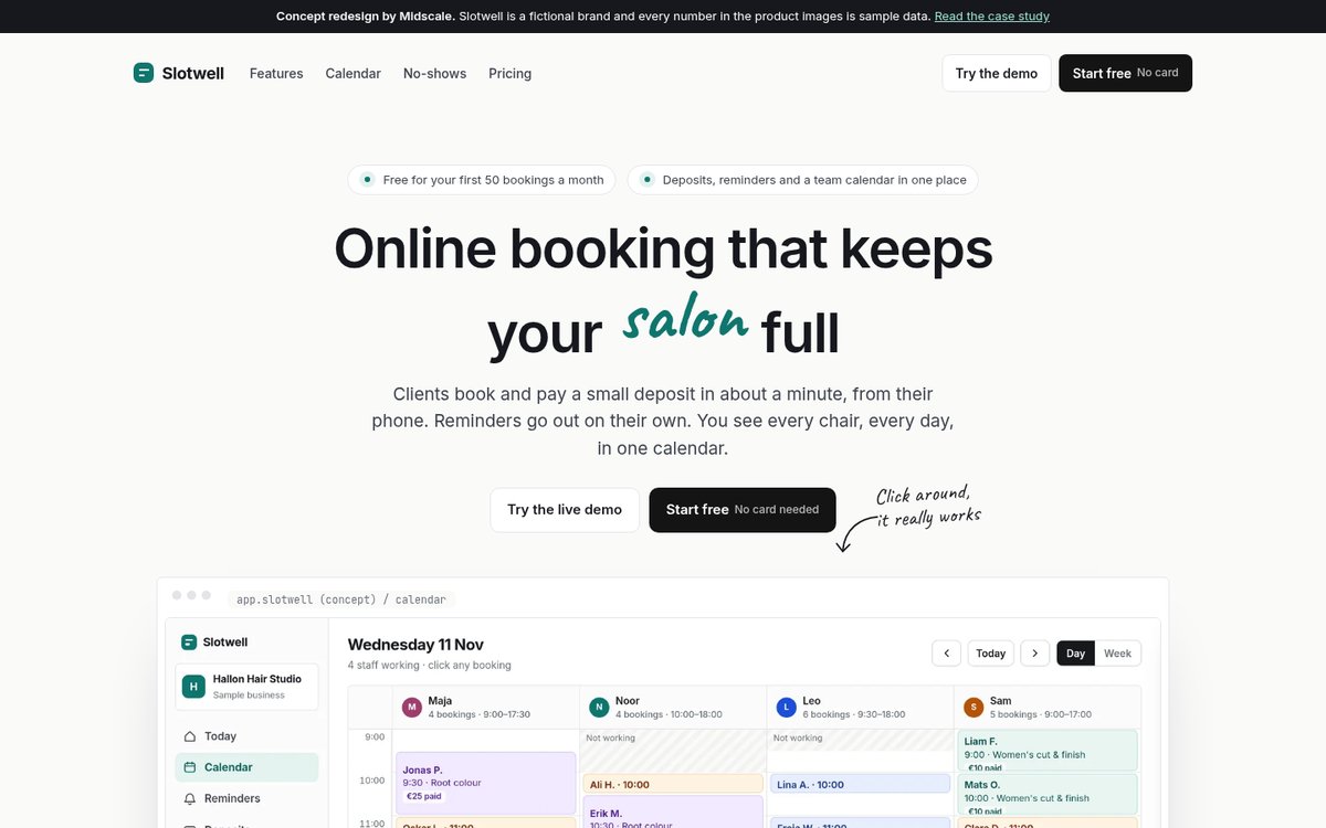
After: the product is the hero.
5. Eight industries, so it’s built for nobody
A “built for every industry” section shows eight stock photos: restaurants, salons, gyms, clinics and more. The site also has around forty industry and feature pages written for search engines, including three separate pages about restaurant booking that say much the same thing.
Wanting a wide market is understandable. But a salon owner and a restaurant manager need very different things, and a page that speaks to both ends up speaking to neither.
The fix: pick the core audience and design for them, then let other types of business recognise themselves. The redesign is written for appointment businesses with a team (salons, barbers, clinics, studios), and the rotating word in the headline does the rest. On the search side, I’d merge the near-duplicates into a few strong pages that each show the product for that industry.
6. The public directory shows one business, called “Test”
The main menu has a “browse businesses” link. It opens an app screen that says “1 business found”, and that business is called “Test”. This is the same site that claims 50,000+ businesses.
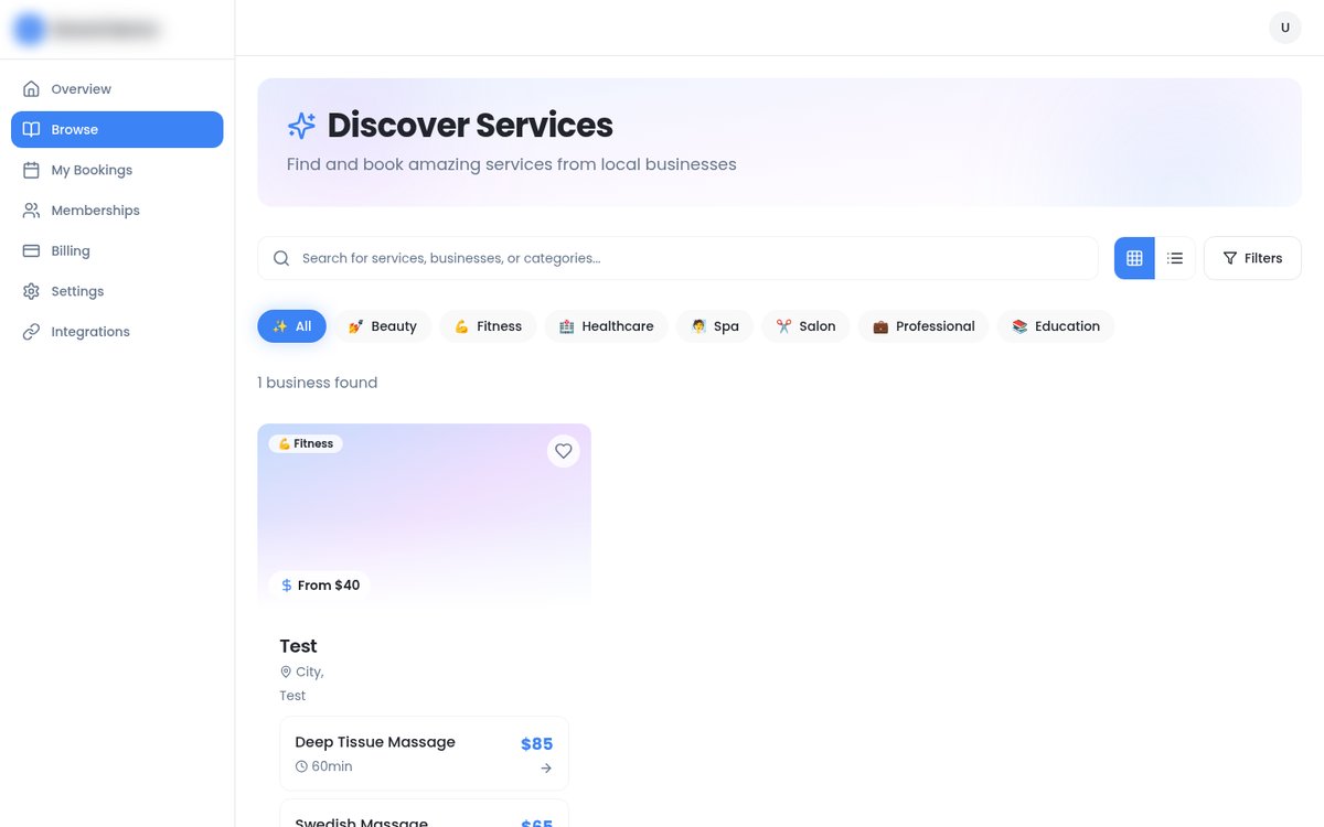
The public browse page. Brand and location blurred.
The fix: don’t link to features that aren’t ready. A half-finished page in the main menu costs more trust than no page at all. Take it out of the navigation until it has real listings, or seed it with clearly labelled examples.
7. An invisible button
At the bottom of the page, the final call to action has two buttons on a blue background. The second one, “View Pricing”, has white text on a white button. Unless you hover over it, it’s a blank white box.
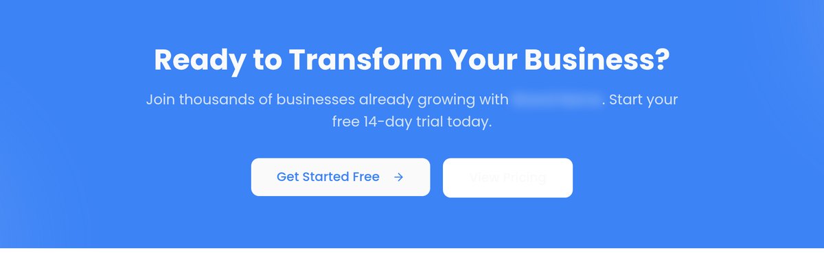
The second button says “View Pricing”. You just can’t see it.
This is a very typical AI-builder bug. A style for one background gets reused on another, and nobody looks at the page closely enough to catch it.
The fix: check contrast on every button, in every state, before launch. It takes five minutes with a free contrast checker and a slow scroll through each page.
8. Pricing works against the main promise
The page promises fewer no-shows, and deposits are the most effective way to get there. But online payments (and with them, deposits) only appear in the second-highest plan. The top plan is described as “everything in Professional”, skipping the plan right below it. There’s also a 14-day trial next to a “forever free” plan, without explaining how the two fit together.
The fix: put the feature your headline promises into the plan most people will pick, and make every plan build clearly on the one before it. The redesign keeps the original’s real plans and prices but moves deposits into the main plan, and says plainly: start free, no card, upgrade when you’re busy.
On a phone
On a phone, the first screen is the badge, the slogan and two paragraphs. The redesign fits the headline, both buttons and a glimpse of the product into the same space.
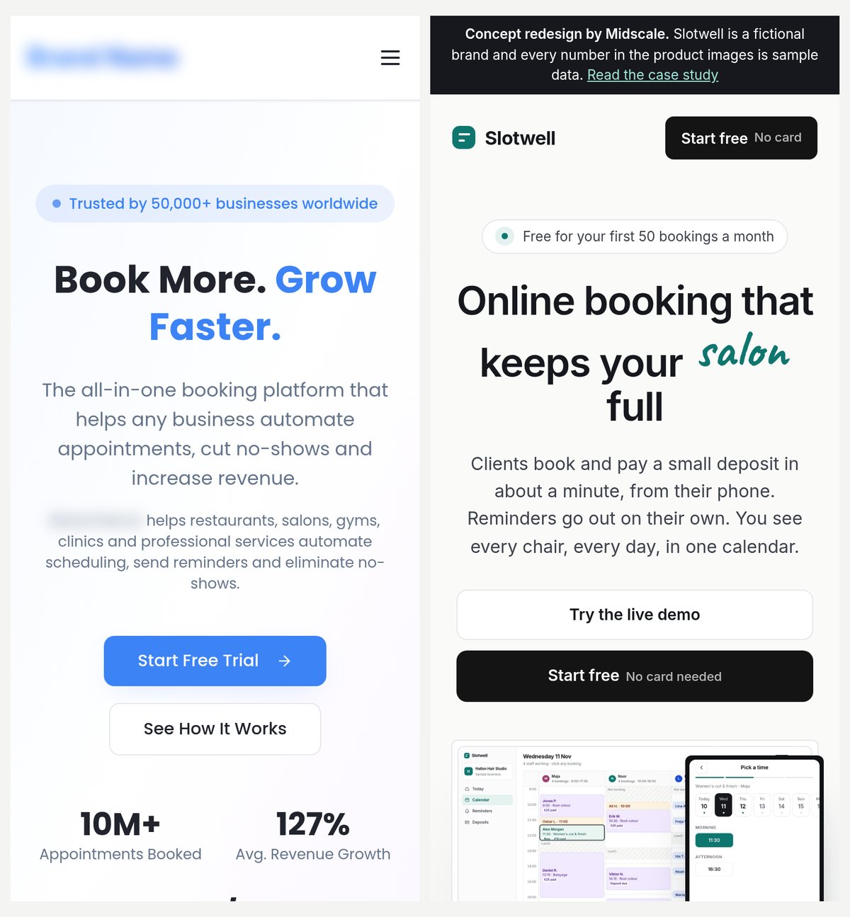
First screen on a phone: before (left) and after (right).
Want to click through it?
I took the redesign further and built Slotwell as a clickable prototype with both sides of a booking: a client picks a service, a stylist and a time, then pays a sample deposit, and the booking appears in the studio’s calendar. The studio side has a team calendar, a weekly staff schedule, reminder settings with a live text preview, and deposit rules. All of the product screens on the redesigned landing page are rendered from that prototype.
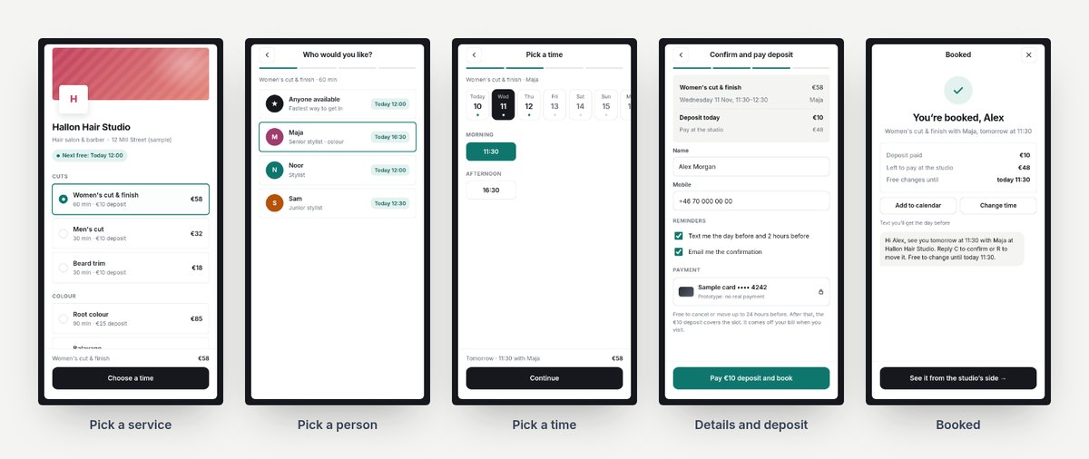
The client’s side of the Slotwell prototype. Sample data.
You can try it, and read the design decisions behind it, in the Slotwell case study.
What this adds up to
None of these are hard engineering problems, and the product behind this page might be very good. Visitors just never get to see it. The page spends its first screen on claims and its buttons on a sign-in wall, when the product itself is the most convincing thing it has.
If you built your app with Lovable, Bolt or Cursor, try this yourself. Open your landing page on your phone in a private window and ask four questions. Can a stranger tell who it’s for in five seconds? Can they see the product without signing up? Is there a number on the page you couldn’t prove? Does every button work and read clearly?
Want this for your app?
This is what my $149 Launch Review covers. I go through your landing page and app the way a new user would, then send a recorded walkthrough and a ranked list of what to fix first. If you want the fixes designed and built, the $149 is credited toward a two-week Launch Sprint (your landing page plus one key user flow) when you book it within 30 days.
Not sure yet? Book a free 20-minute call, show me your page, and I’ll tell you honestly what I’d fix first.