Concept project, not a paid client
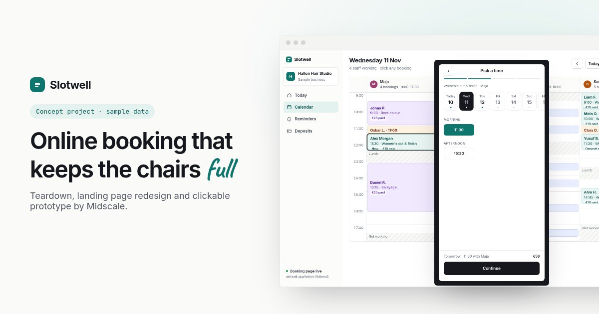
Slotwell: an AI-built booking platform, rebuilt around the product
A self-initiated teardown, landing page redesign and clickable prototype. Slotwell is a fictional brand built on the problems of a real, AI-built appointment booking platform. No client, no invented results, just the thinking and the work.
- Type
- Concept project, not a paid client
- Brand
- Slotwell (fictional)
- Scope
- Teardown, landing page redesign, clickable prototype of client booking and the business calendar
- Built with
- HTML, CSS and vanilla JavaScript
The starting point
This project started with a real, live booking platform for small businesses: salons, gyms, clinics, restaurants and more. It was built with an AI app builder. Clients book online, the business gets reminders, payments and a calendar. It’s a solid, common idea, and behind the sign-in there’s a working product.
The landing page just doesn’t show any of it. I wrote up the full teardown with eight issues. The short version:
- The hero is a slogan (“Book More. Grow Faster.”) that could sell almost anything, followed by two paragraphs saying nearly the same thing.
- Big numbers with no source: 50,000+ businesses, 10M+ appointments, 127% revenue growth. Further down, the same page says “thousands of businesses”.
- The “trusted by” strip is a row of generic names in grey boxes, not real logos.
- There’s no picture of the product on the homepage, and every main button leads to the same sign-in wall. The good demo dashboard exists, but nothing on the homepage links to it.
- The public “browse businesses” page shows one listing, called “Test”.
- In the final call to action, the second button is white text on a white background, so it’s invisible.
To keep this fair to the founder, I’ve blurred their brand and reworded their copy, and from here on everything uses a made-up brand: Slotwell. Nobody hired me for this, and I haven’t seen their analytics, so there are no before-and-after numbers. What you’ll see is what I changed and why.
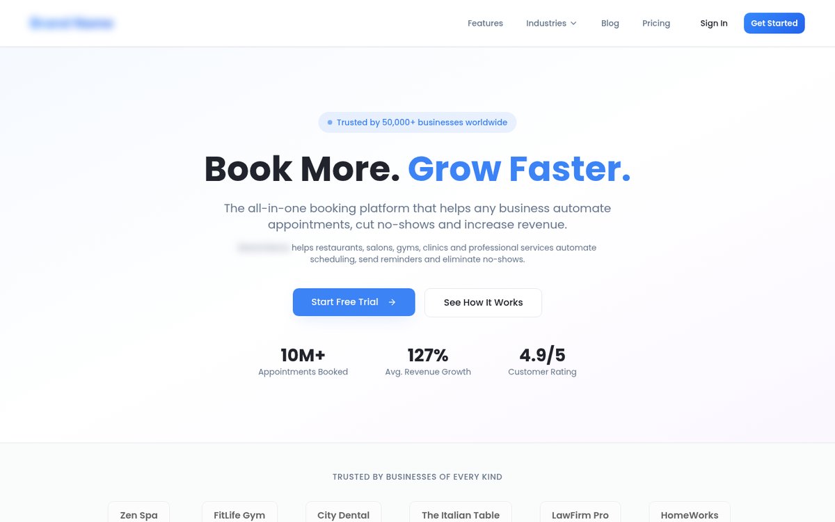
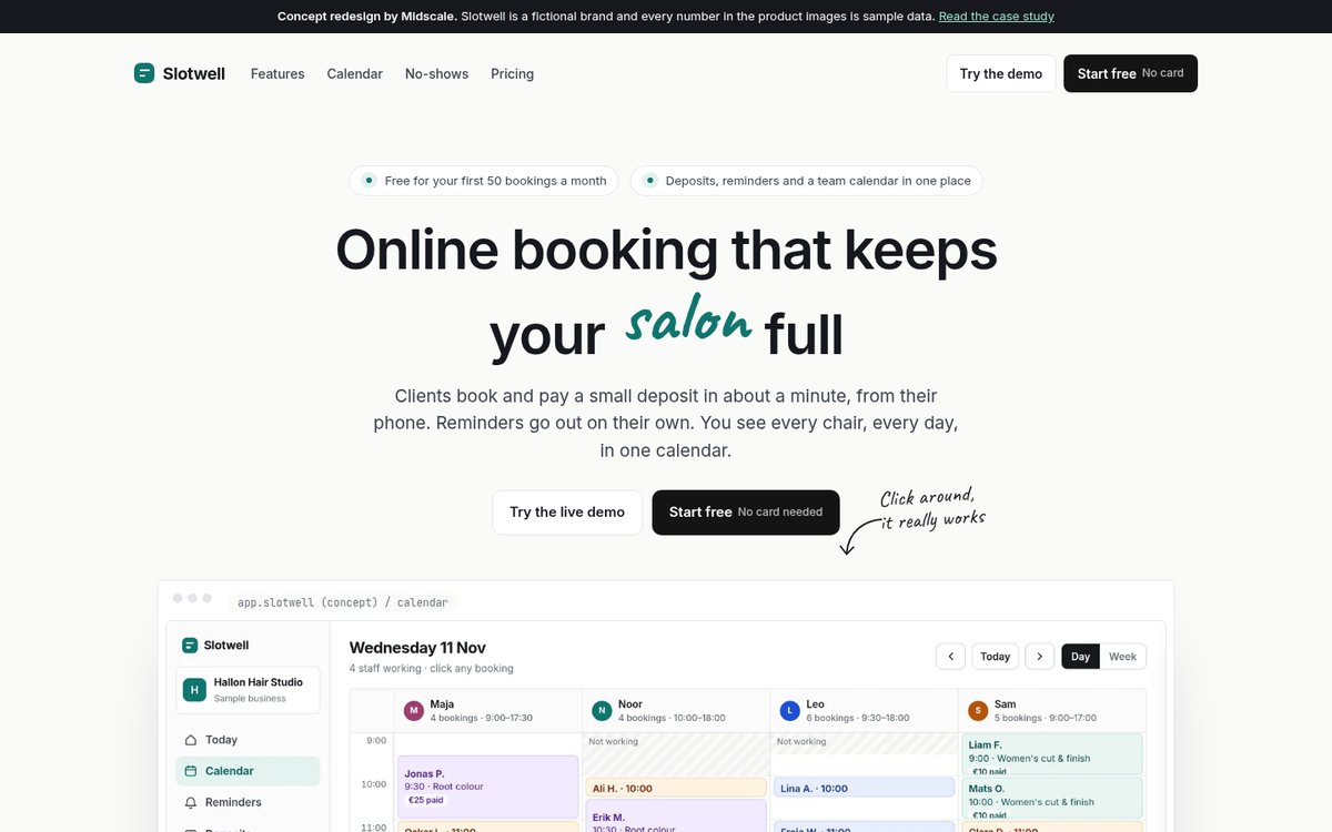
The original hero (brand blurred, copy reworded) and the Slotwell redesign.
Who the page is for
The people buying booking software are salon owners, barbers, physios and studio managers. They’re usually busy and a bit tired of phone tag, and they’ve been burned by tools that looked great and then took a weekend to set up. They don’t care about “automation”. They care about three things:
- Will clients actually use it? Booking has to be quick on a phone, with no account and no app.
- Will it stop the no-shows? Every empty chair is lost money.
- Can my whole team work from it? One calendar everyone trusts, so nobody double-books.
So the redesign has one job: show those three things working, before asking anyone to sign up.
Key design decisions
Say who it’s for, and what it fixes
“Online booking that keeps your salon full” replaces the slogan. The word “salon” rotates through barbershop, clinic, studio and gym, written in a handwritten font, so each type of business sees itself without the page trying to be for everyone at once. The subheading says how it works in plain words: clients book and pay a small deposit from their phone, reminders go out on their own, and you see every chair in one calendar.
Show the product, then show it again
The stats row is gone. In its place is a big preview of the studio calendar, with the client’s phone in front of it. Below the hero, the page is built in three chapters, and each one is a row of cards with real interface screens:
- Booking takes about a minute: the client’s side, step by step on a phone.
- Your whole team, one calendar: the day view by person, the staff schedule and the booking details panel.
- No-shows, handled in the background: the reminder settings and the deposit rules.
Every screen in those chapters is rendered from the working prototype below. They aren’t mock-ups drawn to look nice, which means the page can’t promise anything the product doesn’t do.
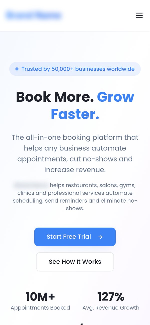
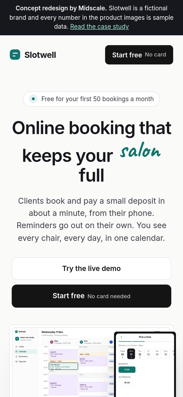
First load on a phone: before and after.
Give the demo the main spot
The original had a good demo dashboard hidden on another page, while every button on the homepage led to the sign-in wall. In the redesign, “Try the live demo” is the first button in the hero and appears again in each chapter. “Start free” stays right next to it, with “No card needed” written on the button itself, because that’s the first thing a cautious owner wants to know.
Swap made-up proof for promises you can keep
The redesign has no visitor counts, no revenue claims and no “trusted by” strip. Instead, a short note near the bottom makes three promises that come from the original’s own pricing page: a free plan with no card, 30 days to get your money back, and every client and booking exportable as a CSV. On a real product, each of these has to be true, so treat them as a checklist for the founder, not copy to paste.
Make pricing match the main promise
I kept the original’s real plans and prices. One change: in the original, payments were only included in the second-highest plan, even though deposits are the most effective tool against no-shows. In the redesign, deposits are in the plan most small businesses would pick. That’s a business decision, not a design one, so it’s flagged here as a recommendation for the founder.
A calm look with one colour that means something
The page uses an off-white background, near-black text and buttons, and a single deep teal for highlights and anything that’s paid or confirmed. Interface screens get room to breathe, and the section headings use two tones: the first sentence in teal says the benefit, the rest explains it. Animation is used sparingly: screens rise in as you scroll, a short statement fills in word by word, and the navigation turns into a floating bar once you scroll. All of it switches off for people who prefer reduced motion.
You can also open the full landing page redesign on its own and scroll through it.
Try the prototype
The landing page promises a quick booking for clients and a calm calendar for the team. So I built both sides as one clickable prototype, for a made-up hair salon, Hallon Hair Studio. Everything in it is sample data.
Things to try:
- As a client, pick a service, a stylist (or “anyone available”), a day and a time. Pay the sample deposit and you get a confirmation and the text message you’d receive.
- Tap See it from the studio’s side. Your booking appears in the calendar, highlighted, with its deposit and reminder timeline.
- Switch the calendar to Week for the staff schedule, and click any booking to mark it as arrived or as a no-show.
- Open Reminders and edit the message. The phone preview updates as you type.
- Open Deposits and change the amount or the free-change window. The policy text updates to match.
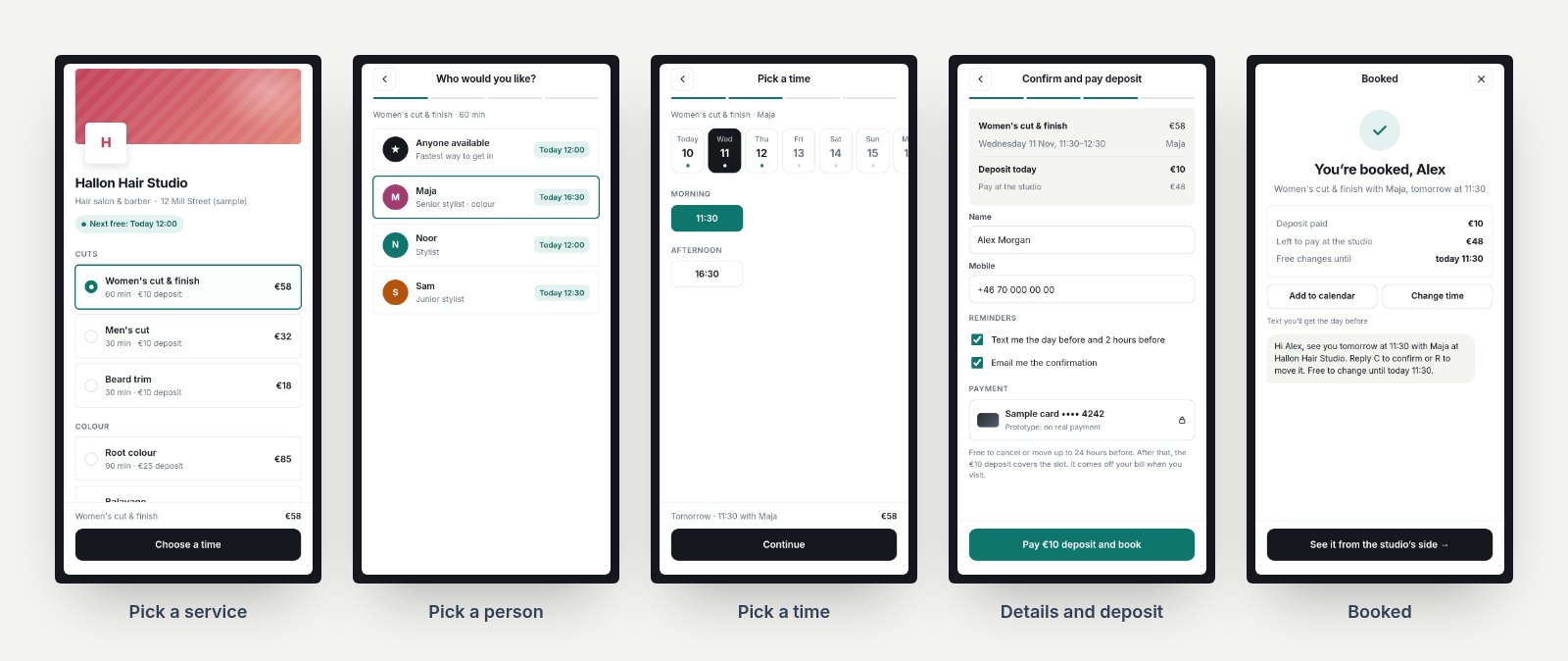
The client’s side: five steps from service to confirmation.
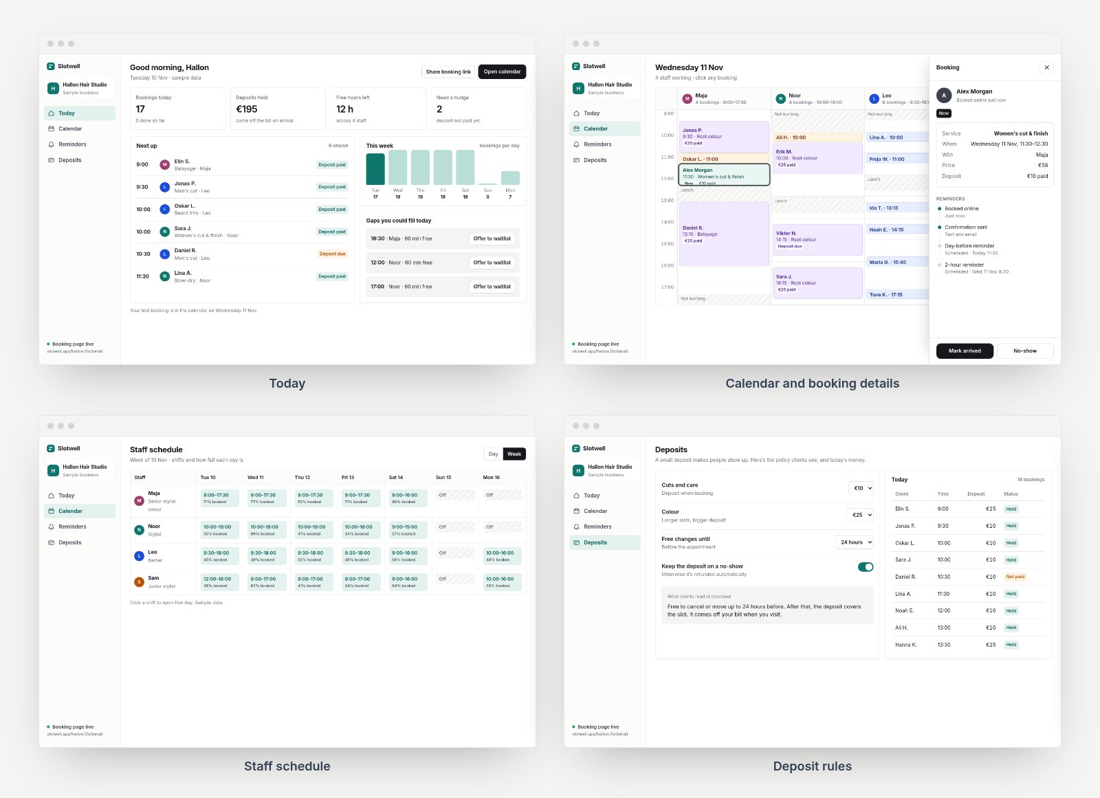
The studio’s side: today at a glance, the calendar, the staff schedule and the deposit rules.
Inside the prototype: what I designed for
- Only show times that are actually free. The time picker reads the same calendar the studio sees, including lunch breaks, shifts and existing bookings. Days with nothing free are greyed out, and tapping one offers a jump to the next free day instead of a dead end.
- Put the deposit policy in one sentence, in the same words everywhere. The client sees it at checkout and in the confirmation text, and the studio edits that exact sentence in the settings. Fewer surprises means fewer arguments at the desk.
- Make the reminder timeline visible. Each booking shows which messages went out and which are scheduled. If someone books too late for the day-before text, the panel says it was skipped and why, instead of quietly pretending.
- Turn gaps into actions. The Today screen lists the free hours, with a button to offer them to the waitlist, so an empty slot becomes something you can do something about.
- Work on the studio’s phone too. On small screens, the sidebar becomes a bottom bar and the booking details open full-screen.
What I’d do next on a real project
If Slotwell were a real client, this concept would be the start of the work, not the end:
- Watch five owners and five clients use it. Short sessions with the prototype. Owners would be checking whether the calendar matches how their day really works, and clients whether booking feels quick and safe.
- Check every claim on the page. Prices, the free plan, the money-back promise and the integrations all need to match the real product before anything ships.
- Measure the funnel. Track demo opens, sign-ups started, first booking page published and first real booking, so the next round of changes is based on what people actually do.
- Tidy up the search pages. The original has dozens of near-identical industry pages. I’d merge them into a few strong ones, each showing the product for that industry.
- Ship the landing page first. It’s the fastest change and the one most likely to affect sign-ups. The in-app improvements can follow in a sprint.