Teardown: 7 fixes for an AI-built fintech landing page
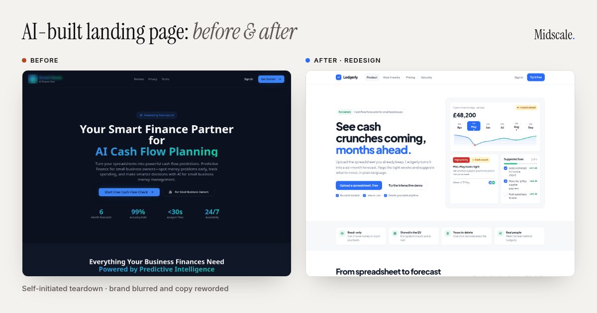
This AI-built landing page sells a genuinely useful finance tool, and it gives a first-time visitor almost every reason to leave. Nothing on it is broken. It just never earns the trust it asks for: your company’s financial data.
I picked a real, live AI-built page, found seven things I’d fix, and redesigned the top of it to show what fixing them looks like. Most of it applies to nearly every Lovable or Bolt page I see.
A quick note on how this was made. Nobody hired me for this. It’s a self-initiated teardown of a public page, picked because it’s a typical AI-built SaaS site in the finance space. I’ve blurred the brand and lightly reworded the copy so the company can’t be identified, and I haven’t seen their analytics, so there are no “conversion went up 40%” claims here. The “after” is a concept mock with a made-up name, Ledgerly. I’m judging the page the way a first-time visitor would.
The page
It’s a cash flow forecasting tool for small businesses: upload a spreadsheet, get a six-month cash prediction. Here’s how the page presents it:
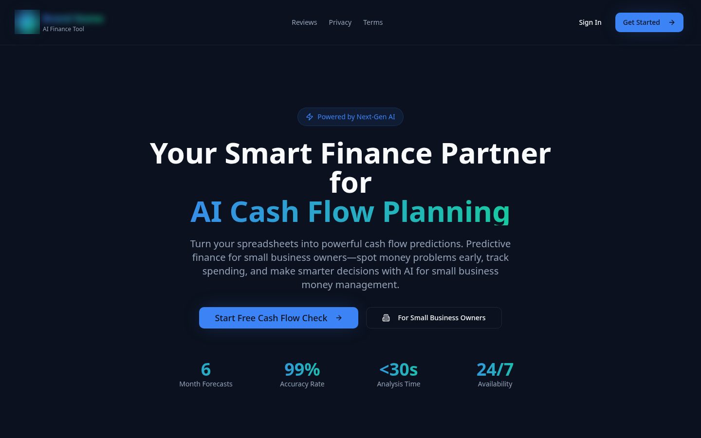
Before, desktop. Brand blurred, copy lightly reworded.
1. The headline names categories, not an outcome
The original headline stacks two labels: a role (“your fractional CFO”) and a technology (“AI cash flow forecasting”). Neither tells an owner what changes for them. Visitors have to translate it into “so this tells me when I’ll run low on cash” themselves, and most won’t.
The fix: Lead with the outcome, in the words an owner would use. The redesign says: See cash crunches coming, months ahead. The subheading then explains how in one sentence: upload the spreadsheet you already keep, and get a six-month forecast with the tight weeks flagged.
2. The copy is written for Google, not for people
Across the page, one phrase about AI for small business finance appears four times, “fractional CFO” six times and “predictive accounting” five times. That’s keyword stuffing, and it reads that way. It makes the page feel generated, which is the last impression you want when you’re asking for someone’s financial data.
The fix: Write each section for a person, once. Put your search terms where they belong: the page title, the meta description and one or two headings, where they read naturally.
3. The stats strip hurts trust instead of building it
Under the buttons sit four big numbers: 6 (month forecasts), 99% (accuracy rate), under 30 seconds (analysis time) and 24/7 (availability). Two of them are features dressed up as stats, since software being available around the clock is a given. The 99% is the real problem. There’s no source, no definition and no sample size, and anyone who has run a business knows nobody can forecast cash flow to 99%. In finance, one claim that feels made up makes people doubt everything else on the page.
The fix: Drop numbers you can’t back up. The redesign answers the accuracy question honestly instead: it depends on your history, so every chart shows a range rather than one confident number. If you have real proof, like customer counts, a named testimonial or an accountant who vouches for you, use that.
4. Two buttons, one destination, and nothing to see
The hero has two buttons. The second one looks like a label (“For small business owners”), but it’s a button, and both go straight to the sign-up page. There isn’t a single image or product screenshot on the page either. So the only way to find out what this product looks like is to create an account and hand over a spreadsheet of your finances.
The fix: One clear primary action, plus a low-commitment second one. In the redesign, the main button is “Upload a spreadsheet, free” and the secondary one opens an interactive demo with sample data, no account needed. Most importantly, the hero shows the product: a cash card with a six-month strip, a “Mid-May looks tight” alert with a priority tag, and the suggested fixes. Visitors see the value before they’re asked for anything.
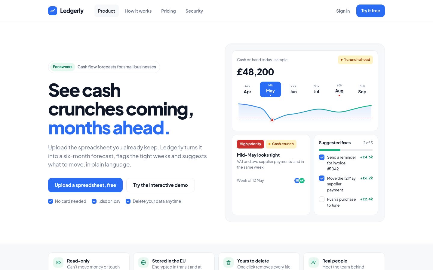
After, desktop. A concept mock with a placeholder brand. It keeps the original’s blue, and the hero now shows the product and asks for one thing.
5. Trust signals are generic where they need to be specific
This product asks people to upload their bookkeeping. The page covers security with one card promising “bank-grade encryption”, which every SaaS site says. It doesn’t say where data is stored, whether the tool can touch your bank account, how to delete your data or who’s behind the company.
The fix: A short, specific trust strip right under the hero, where the doubt shows up. In the mock: read-only, stored in the EU, one-click deletion and a link to the real people behind it. These are placeholders, so on a real site only claim what’s true, but specific statements like these answer the questions an owner is actually asking. Then a three-step “how it works” section shows exactly what happens to their file.
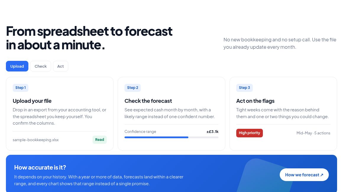
After: the “how it works” section, with the accuracy question answered honestly instead of a 99% badge.
6. On a phone, the first screen is mostly chrome
On a phone, the logo and its tagline wrap onto several lines, so the header takes up about a sixth of the screen. On first load, the cookie banner then sits on top of the subheading and both buttons. The first thing a new visitor sees is a cookie question, not the product. Many of the nav and footer links are also only 20 pixels tall, below the 24-pixel minimum in WCAG 2.2 and well under the 44 pixels usually recommended for thumbs.
The fix: A compact one-line logo, a single header button and a cookie banner that sits as a slim bar at the bottom instead of over the pitch. Give every tappable link at least 44 pixels of height with padding. In the redesign, the headline, the button and the reassurance line all fit on the first screen.
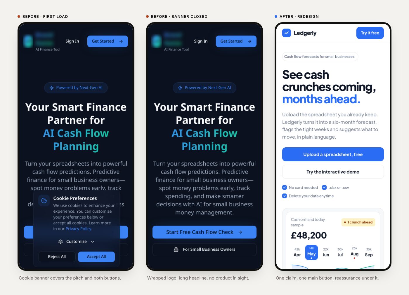
Mobile: before on first load, before with the banner closed, and after.
7. The share preview is a stretched logo
When someone pastes this link into LinkedIn, Slack or iMessage, the preview image is an AI-generated logo. It’s a portrait image (796 × 1024 pixels, about 520 KB), the same file is used as the favicon, and link previews crop it into a wide frame.
The fix: A proper 1200 × 630 share image with your headline and a product shot, plus a small, square favicon. It’s an hour of work that pays off every time someone shares the link.
Want to click through it?
I took the redesign further and built Ledgerly as a clickable prototype: a dashboard, the six-month forecast, the mid-May alert with fixes you can tick off, an upload flow and a security screen. It’s all sample data, and you can try it in the Ledgerly case study, along with the design decisions behind it.
What this adds up to
None of these are engineering problems, and the product behind the page might be excellent. Visitors just never get far enough to find out, because the page asks for trust before earning any. The redesign doesn’t add features. It shows the product, makes one honest promise and removes the reasons to doubt it.
If you built your app with Lovable, Bolt or Cursor, try this yourself. Open your landing page on your phone in a private window and ask three questions. Can a stranger tell what it does for them in five seconds? Can they see the product before signing up? Is there anything on the page they’d suspect is made up?
Want this for your app?
This is what my $149 Launch Review covers. I go through your landing page and app the way a new user would, then send a recorded walkthrough and a ranked list of what to fix first. If you want the fixes designed and built, the $149 is credited toward a two-week Launch Sprint (your landing page plus one key user flow) when you book it within 30 days.
Not sure yet? Book a free 20-minute call, show me your page, and I’ll tell you honestly what I’d fix first.