Concept project, not a paid client
Ledgerly: turning an AI-built cash flow page into a product people trust
A self-initiated teardown, redesign and clickable prototype. Ledgerly is a fictional brand built on the problems of a real, AI-built cash flow app. No client, no invented results, just the thinking and the work.
- Type
- Concept project, not a paid client
- Brand
- Ledgerly (fictional)
- Scope
- Teardown, landing page redesign, clickable app prototype
- Built with
- HTML, CSS and vanilla JavaScript
The starting point
This project started with a real landing page. It belongs to a small cash flow forecasting app for small businesses, built with an AI app builder. You upload a spreadsheet, and it predicts your cash for the next six months. That’s a genuinely useful idea.
The page wasn’t broken, but it made a first-time visitor work far too hard to trust it. I wrote up the full teardown with seven issues. The short version:
- The headline stacked buzzwords (“fractional CFO”, “AI cash flow forecasting”) instead of saying what changes for the owner.
- The copy repeated the same search phrases over and over, so it read as generated.
- A “99% accuracy” stat with no source sat right under the buttons.
- Both hero buttons led to sign-up, and there was no product image anywhere on the page.
- Security was one generic “bank-grade encryption” line, on a product that asks for your bookkeeping.
- On a phone, the cookie banner covered the pitch and both buttons on first load.
To keep this fair to the founder, I’ve blurred their brand and reworded their copy, and everything from here on uses a made-up brand: Ledgerly. Nobody hired me for this, and I haven’t seen their analytics, so there are no before-and-after numbers. What you’ll see is what I changed and why.
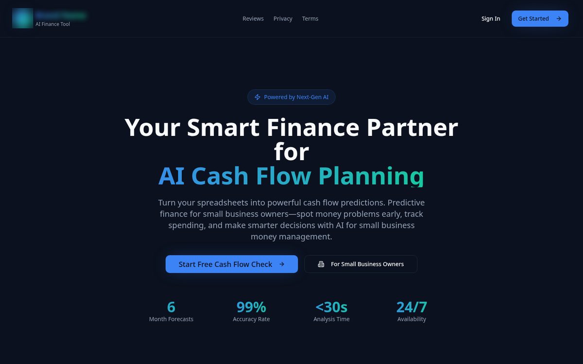
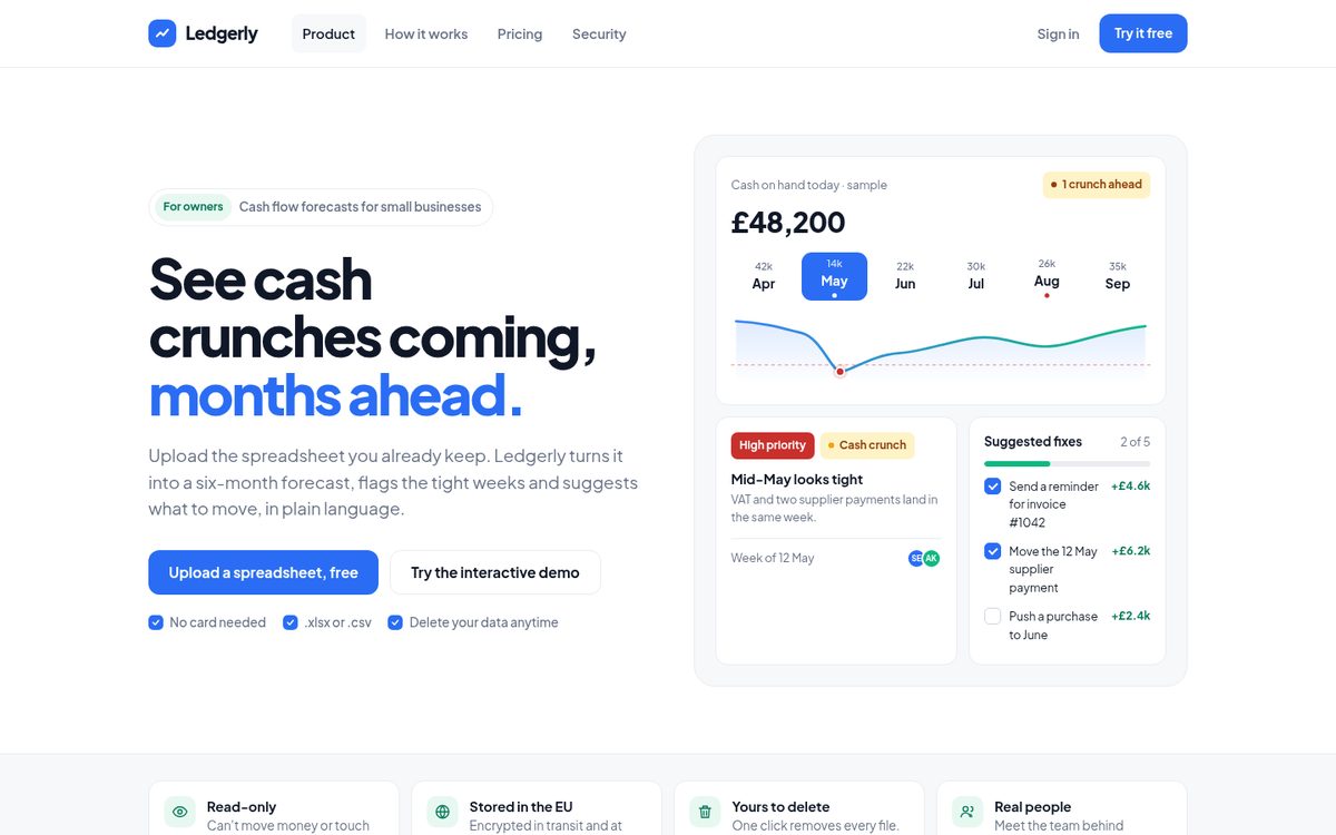
The original hero (brand blurred, copy reworded) and the Ledgerly redesign.
The goal
Small business owners are usually a bit anxious about cash, and they’re being asked to hand over their financial data to a tool they found five minutes ago. So I set four goals:
- Say what it does in one sentence a busy owner would actually use.
- Show the product before asking for anything, so the value is visible without an account.
- Be honest about uncertainty. A forecast is a range, not a promise.
- Make it feel calm. White space, clear hierarchy and colour that only shows up when it means something.
Key design decisions
Lead with the outcome
“See cash crunches coming, months ahead” replaces two stacked category labels. The subheading explains how in plain words: upload the spreadsheet you already keep, get a six-month forecast and a heads-up about the tight weeks. The aim is that a visitor can tell what it does for them without scrolling.
Show the product instead of stats
The four big numbers are gone. In their place, the hero shows a preview of the real app: cash on hand, a six-month strip with the tight months marked, a “Mid-May looks tight” alert and the suggested fixes. The secondary button now opens an interactive demo with sample data, so curious visitors can explore before signing up. That should lower the risk of the first click, which matters most for people who aren’t sure yet.
Replace “99% accuracy” with an honest range
Nobody can forecast cash flow to 99%, and owners know it. Ledgerly shows a shaded likely range on every chart and answers “How accurate is it?” directly: it depends on your history. I’d expect that honesty to build more trust than a big number, especially with an audience that reads financial claims for a living.
Put specific trust where the doubt is
Right under the hero, four short cards answer the questions owners actually ask: can it touch my bank (no, it’s read-only), where is my data (the EU), can I delete it (one click) and who’s behind it. On a real product, every one of these has to be true, so treat them as a checklist for the founder rather than copy to paste.
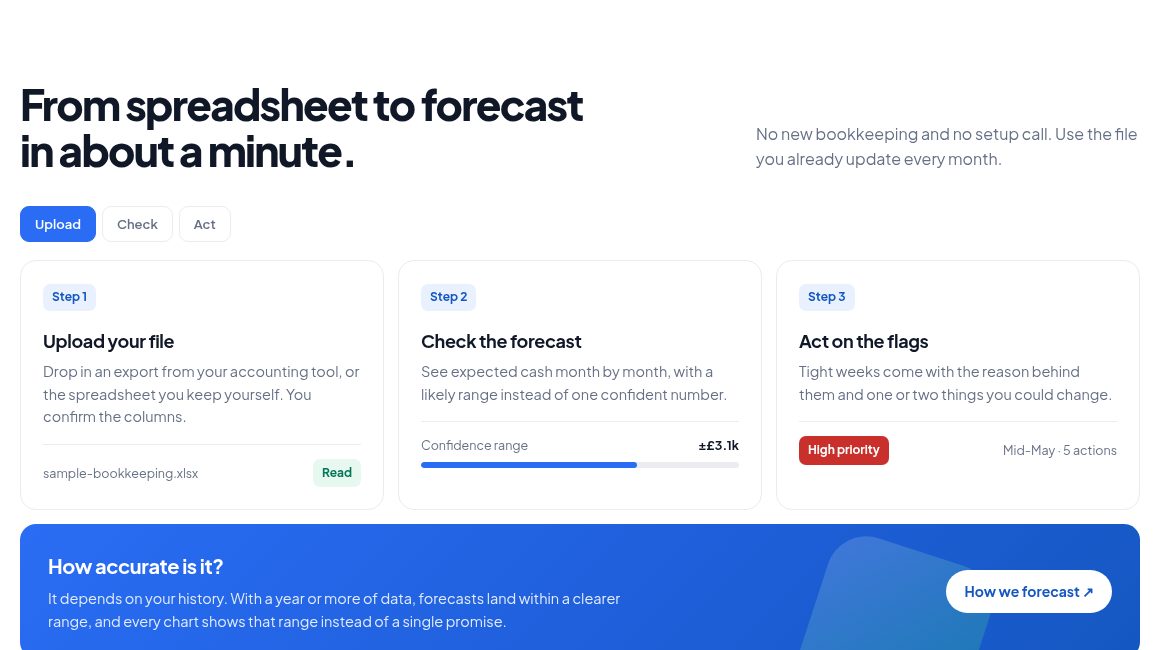
“How it works” shows what happens to your file in three steps, and answers the accuracy question in plain words.
Fix the first screen on a phone
A one-line logo, one header button and a cookie banner that doesn’t cover the pitch. In the redesign, the headline, the main button and the reassurance line all fit on the first screen of a phone.
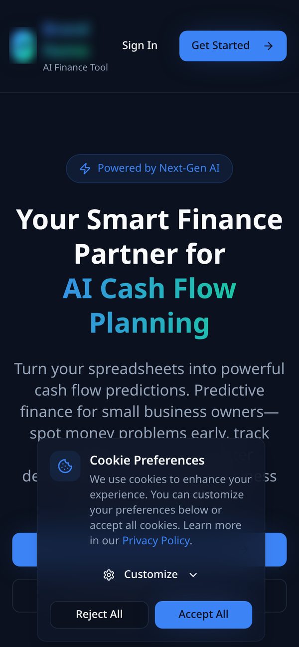
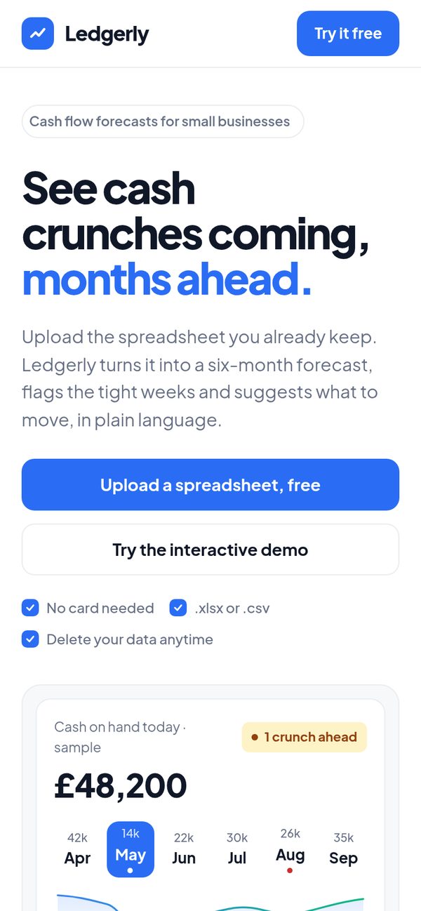
First load on a phone: before and after.
A calm visual language that keeps the brand’s blue
The original used a bright blue, and I kept it, because a redesign shouldn’t throw away brand recognition for no reason. Everything else changed: a white canvas, light grey only for subtle contrast, white rounded cards with thin borders, and a single clean sans-serif typeface. Colour is reserved for meaning. Blue is for actions and selected states, red for high-priority alerts, amber for things to watch and green for progress. The blue I used for buttons and text passes WCAG AA contrast with white (4.6:1). The lighter sky blue only appears in the charts.
Try the prototype
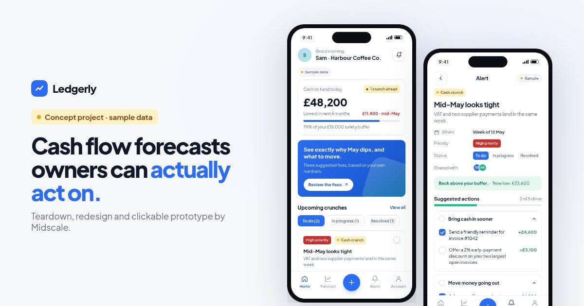
The landing page promises that owners will see crunches coming and know what to do about them. So I built the app experience behind that promise as a clickable prototype. Everything in it is sample data for a made-up coffee business.
Things to try:
- On Home, tap Mid-May looks tight, then tick a few suggested actions. The projected low point updates as you go, until the week is back above the safety buffer.
- Open Forecast, switch months in the strip, and tap the red dip on the chart to see exactly why May drops.
- Tap the round + to try the upload flow with a sample file.
- Open Account to see how security is explained, and try deleting your data to see the empty state.
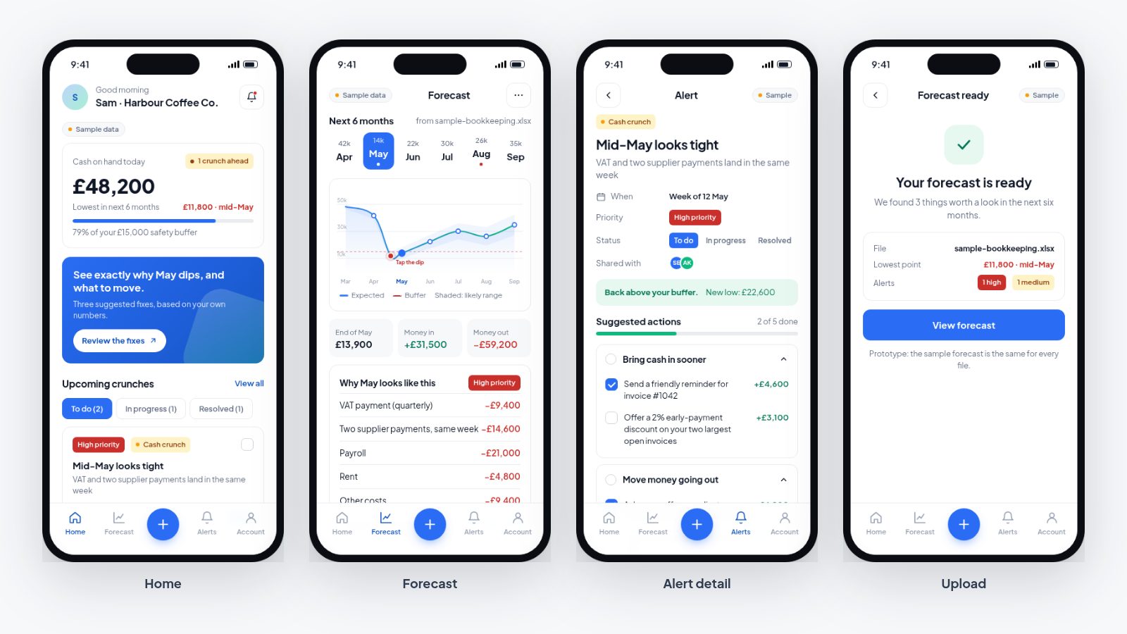
Four of the prototype’s screens: Home, Forecast, Alert detail and Upload.
Inside the app: what I designed for
- Alerts work like tasks, not warnings. Each crunch has a priority, a status (to do, in progress, resolved) and a short checklist of things the owner could change, each with the amount it would add back. A warning alone just causes stress. A warning with two or three concrete moves gives the owner something to do.
- Every number explains itself. Tap a month and you get the breakdown behind it, so a scary dip turns into “VAT and two supplier payments land in the same week”.
- The upload flow says what’s happening. Instead of a spinner, it shows each step: reading columns, matching money in and out, spotting regular payments and building the forecast. It also says plainly that the prototype doesn’t upload anything.
- Deleting data is easy to find. It sits on the Account screen, asks once to confirm, and leads to a clear empty state with a way back in.
What I’d do next on a real project
If Ledgerly were a real client, this concept would be the start of the work, not the end:
- Test it with five owners. Short sessions with the prototype, watching where they hesitate. That should show quickly whether the alerts-as-tasks idea makes sense to people.
- Check the real data. Spreadsheets are messy. I’d design for the hard cases: missing months, odd column names and multiple bank accounts.
- Measure the funnel. Set up events for landing page CTA clicks, demo opens, uploads started and forecasts viewed, so the next round of changes is based on what people actually do.
- Run a proper accessibility pass, with a screen reader and keyboard-only, before launch.
- Ship the landing page first. It’s the fastest change and the one most likely to affect sign-ups. The app improvements can follow in a sprint.