Teardown: a real credit company’s website, and how to make a price easy to trust
If you sell something people have to trust before they buy, your price is part of your brand. The way you show it matters as much as the number.
This teardown is about a real Swedish credit company: Fairlo. They offer a kontokredit (a revolving credit line) of up to 70 000 kr, with the credit provided by Bankaktiebolaget Nordiska. Their whole idea is fairness: the same interest rate for everyone, no hidden fees, B Corp certified, and a “Fairnesskvitto” (fairness receipt) that shows what every transaction costs. That’s a better trust story than most lenders have.
A note on how this was made. Nobody hired me for this, and Fairlo isn’t a client. I read their public site and rebuilt the key pages as a concept, using only their own words, prices and legal texts, copied word for word. I haven’t seen their analytics, so there are no “applications went up 30%” claims here. The people in the redesign are AI-generated models, not customers.
The concept, liveOpen the full Fairlo conceptA homepage, a price page and an apply page, built from Fairlo’s own content. Try the calculator.Open the concept site →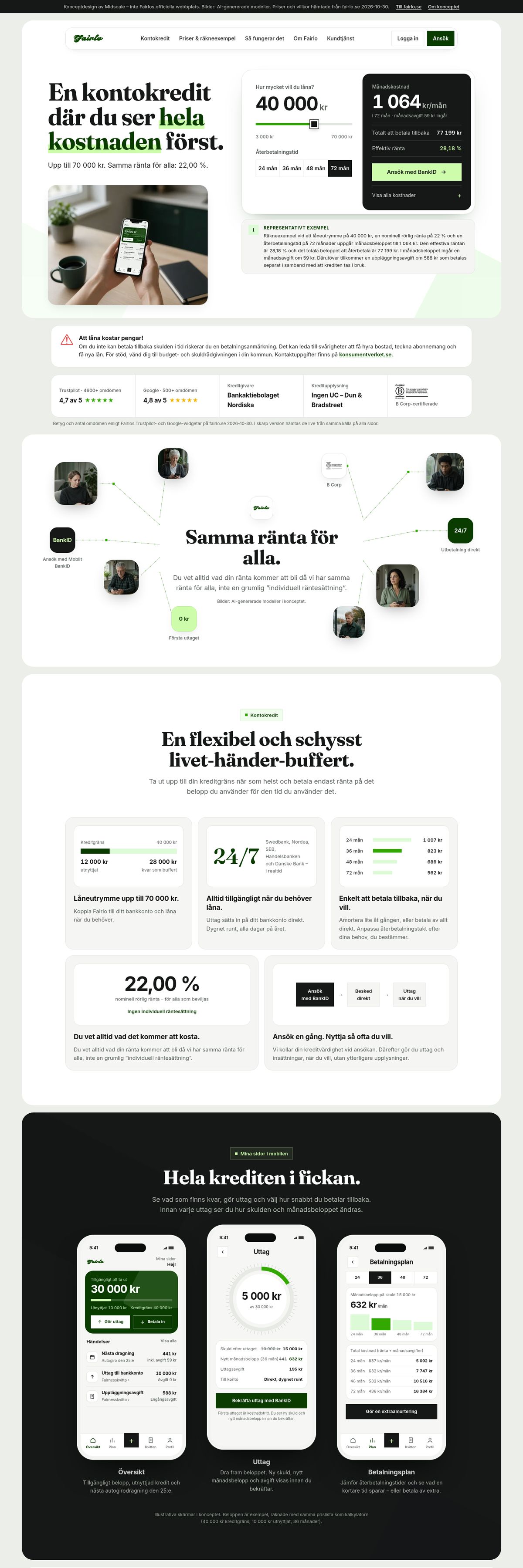
Direct link: midscalemedia.com/work/fairlo/site/
Who the website is for
Someone looking at a credit company is usually asking three things: what does it cost, can I get it, and can I trust these people? They’re often a little stressed, and most are on a phone. A good finance site answers those three questions calmly, in that order, and never makes the visitor do the maths themselves.
Fairlo’s site is well built. On desktop it scores 99 for performance in Lighthouse, and the brand voice is distinctive. The problems below aren’t about a broken site. They’re about a strong promise that the page doesn’t fully show.
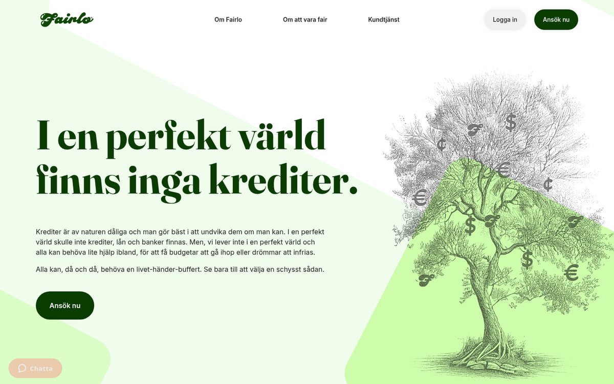
The homepage today, on a laptop.
1. The first screen doesn’t say what you’re selling
The homepage opens with “I en perfekt värld finns inga krediter.” (“In a perfect world there would be no credit.”), followed by a paragraph about credit being bad by nature. It’s brave, honest and very on-brand. But the first screen has no product name, no amount and no price, and many visitors arrive straight from a search ad.
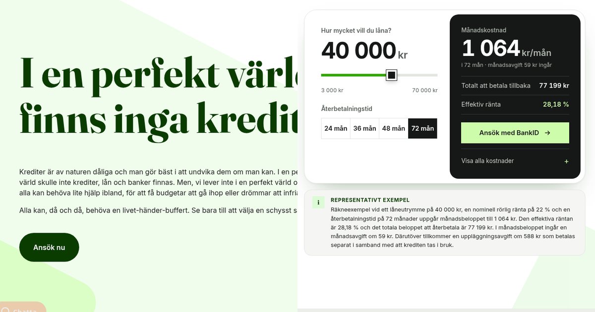
The fix: lead with what it is and what it costs, then let the brand voice do its work further down. In the concept the headline says “En kontokredit där du ser hela kostnaden först.” (“A credit line where you see the whole cost first.”), with one line underneath: up to 70 000 kr, the same rate for everyone, 22,00 %.
2. The same price, stated four ways
The product pages say “20-22%”. Customer service says “22,00 %”. The FAQ says “up to 22%”. The legal information form says 22,00 %. The monthly fee and the setup fee also differ between pages, and the calculator leaves the monthly fee out.
Each version probably made sense when someone wrote it. Together, they make a visitor wonder which one is true, and for a company whose promise is “you always know what it costs”, that’s the most expensive kind of inconsistency.
The fix: keep every price in one place and show it everywhere from there. In the concept, one data file holds the rate, the fees and the official example. The calculator, the price page, the apply page and the footer all read from it, so they can’t disagree. I used the legal form as the source and listed every other version for Fairlo to confirm, rather than guessing.
3. Let people try the price, don’t just describe it
Fairlo has a good calculator, but it’s halfway down a sub-page, and it rounds the effective rate to “29 %” while the official example on the same page says 28,18 %.
The fix: put the calculator where people decide. In the concept it’s in the hero: pick an amount and a term, and you see the monthly cost, the total to pay back and the effective rate, with one button next to it. Everything else is one tap away. At the default setting it shows exactly Fairlo’s official example (1 064 kr a month, 77 199 kr in total, 28,18 %), and the build checks this every time.
4. Make the fine print part of the design
Credit companies in Sweden have to show a representative example and a warning that borrowing costs money. Fairlo shows both, but the example is small text at the very bottom of every page.
The fix: don’t hide what you’re required to say. Put it next to the decision. In the concept, the full example sits directly under the calculator, word for word, followed by the warning. Showing it openly fits the brand far better than burying it.
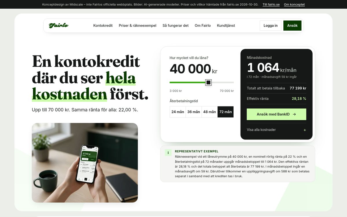
After: the same product and prices, price first. The person holding the phone is an AI-generated model.
5. Show your proof instead of describing it
Fairlo’s most original idea is the Fairnesskvitto, a receipt that shows what each transaction costs and what Fairlo makes on it. On the website it’s only described in words.
The fix: if you have something that makes you more trustworthy than your competitors, show it. The concept draws the receipt for the official example: 77 199 kr split into the amount borrowed, interest, monthly fees and the setup fee. It changes as you move the calculator. Fairlo’s real receipt also shows their own costs and margin. I don’t have those numbers, so the concept says where to find them rather than making them up.
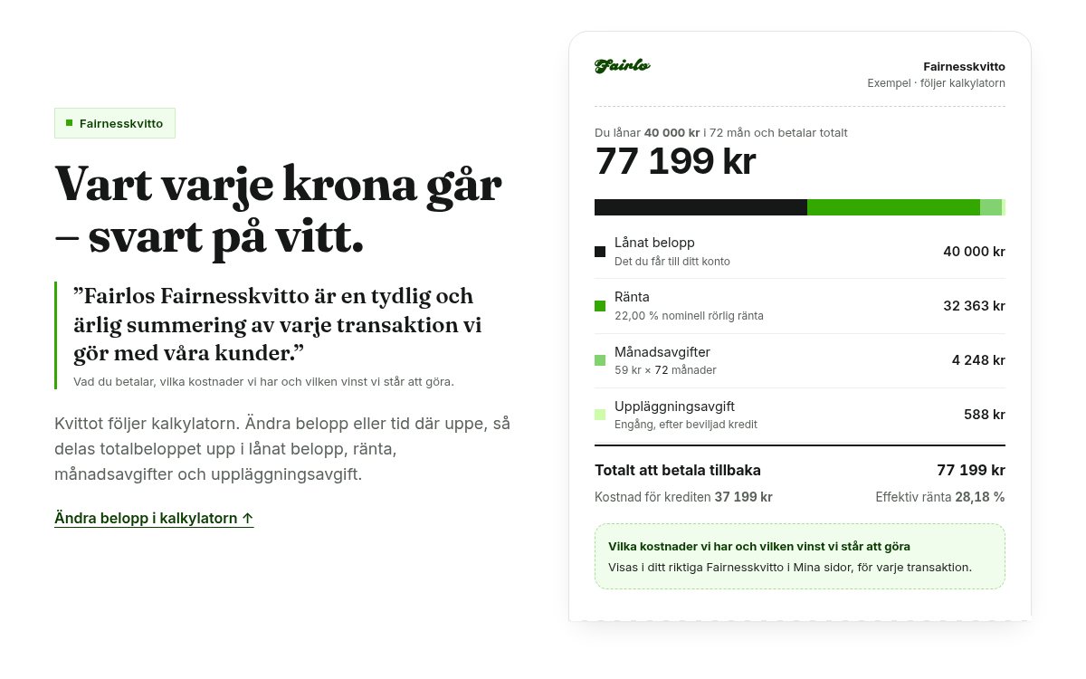
The receipt uses the same pricing file as the calculator, so the two always agree.
6. Shorten the path, and make it fast on a phone
“Ansök nu” leads to a second sales page with another “Ansök nu” before anything starts, and the price is behind a small grey link there. On a phone, four of the five benefits are hidden in a sideways carousel. In my one Lighthouse run on simulated mobile, the homepage scored 49 for performance, mostly because of around ten third-party scripts for chat, tag management and ad tracking.
The fix: one step from the button to BankID, with the requirements, the visitor’s own calculation and the price shown right there. A list instead of a carousel. And only the scripts you really need, loaded when they’re needed. The concept loads no third-party scripts. When I ran Lighthouse on it myself (served locally, so not a like-for-like comparison), it scored 93 on mobile and 100 on desktop.
What the redesign keeps
Everything real. Fairlo’s own sentences (including “I en perfekt värld finns inga krediter”, now lower down the page), the same rate, fees and limits, the representative example and the warning word for word, the lender details, and their own illustrations as quiet accents. The scroll animation is calm, it never delays the calculator, the button or the legal text, and it switches off for anyone who has “reduce motion” turned on.
What’s new is the order: the price first, then the proof, then the button. The design decisions are in the case study.
Try this on your own site
Open your homepage on your phone in a private window and check four things:
- Can a stranger tell what you sell and roughly what it costs in five seconds?
- Is every price, fee and rate the same on every page, including your FAQ and your terms?
- Is the fine print you’re required to show next to the decision, or hidden in the footer?
- Do you show your best proof, or only describe it?
Want this for your website?
I can go through your website the way a new customer would, then send you a recorded walkthrough and a ranked list of what to fix first: unclear prices, numbers that disagree, buried fine print, a slow phone experience. If you want the fixes designed and built too, we can do that together.
Book a free 20-minute call, show me your site, and I’ll tell you honestly what I’d fix first.