Teardown: a real dental clinic’s website, and what patients actually need from it
Most small businesses don’t need a new brand. They need the website they already have to stop getting in the way.
This teardown is about a real dental clinic: Ramstenkliniken, on Högbergsgatan between Slussen and Medborgarplatsen on Södermalm in Stockholm. Two dentists, a hygienist and a receptionist. They take children under the free care scheme, they’re certified for Invisalign, and they say they’re used to nervous patients. All good things for a patient to know.
A note on how this was made. Nobody hired me for this, and Ramstenkliniken isn’t a client. I read every page of their public site and rebuilt it as a concept using only their own words, prices and people. I haven’t seen their analytics, so there are no “bookings went up 40%” claims here. The portrait in the redesign is an AI-generated model, not a patient.
The concept, liveOpen the full Ramstenkliniken conceptOne page with every section of their site, built from their own content.Open the concept site →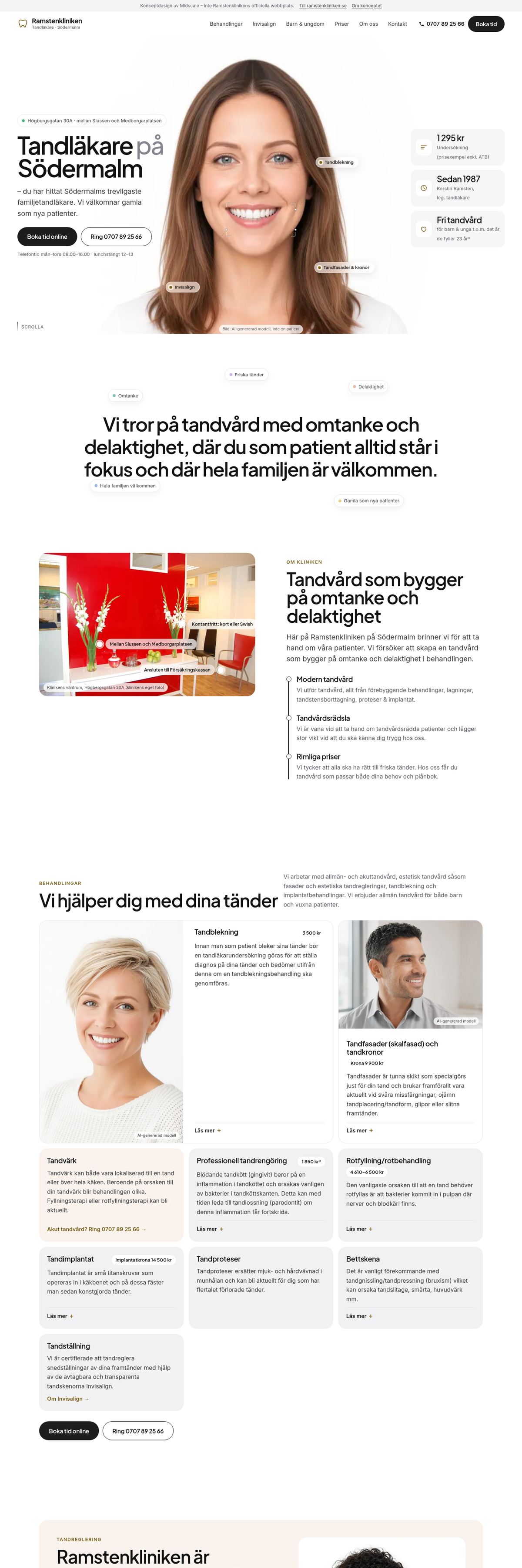
Direct link: midscalemedia.com/work/ramstenkliniken/site/
Who the website is for
Someone looking up a dentist is usually doing one of four things: booking a time, calling, checking a price, or making sure the clinic is close and feels right. Many are a bit nervous. Most are on a phone. Everything on the site should help with one of those four, and nothing should make them doubt whether the clinic is still running.
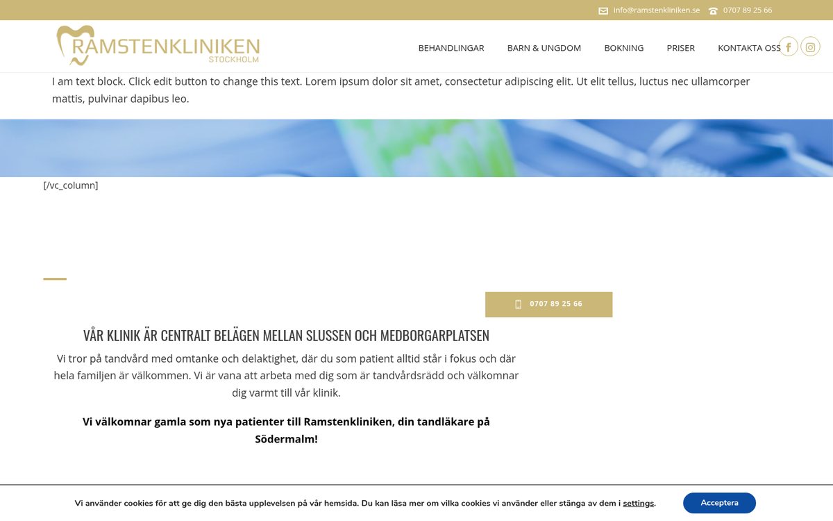
The homepage today, on a laptop.
1. The first words are placeholder text
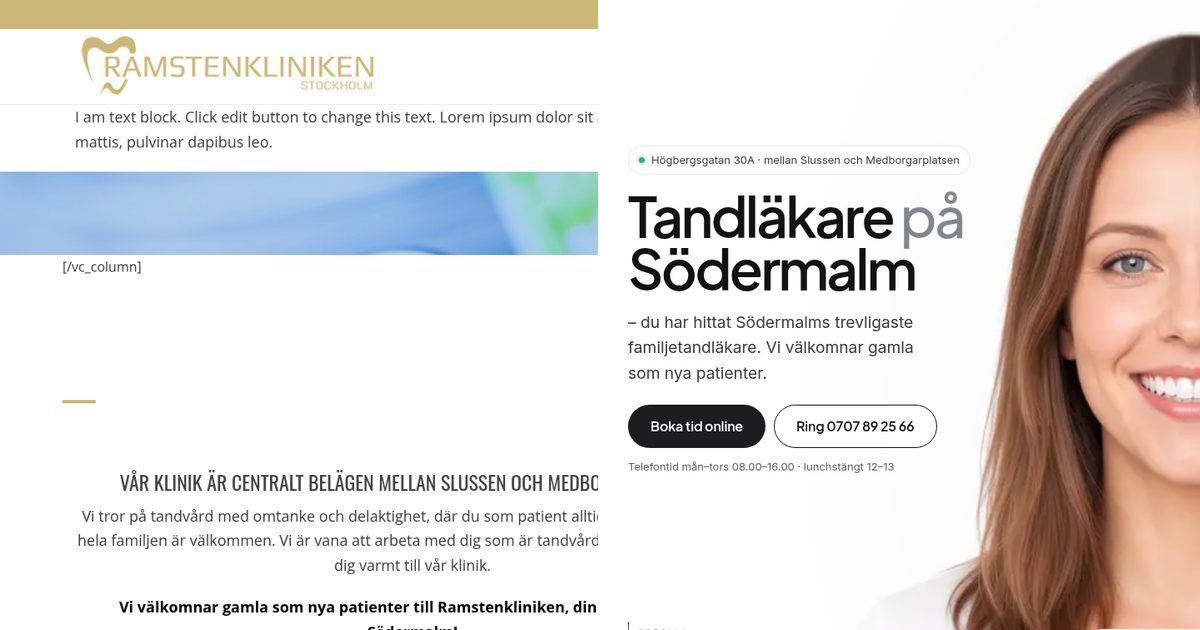
Right under the logo: “I am text block. Click edit button to change this text. Lorem ipsum dolor sit amet…” and then a piece of page-builder code, [/vc_column]. The clinic’s real headline exists, but you don’t see it there.
It’s an easy mistake. Someone added a block while editing and never removed it. But to a patient it says “nobody looks after this”, which is the opposite of what you want from a dentist.
The fix: check the live homepage on a phone after every edit. In the concept, the first screen says who, what and where: “Tandläkare på Södermalm”, the address, and two buttons.
2. Online booking exists, but it’s hidden
The clinic uses Muntra for online booking, so patients can book any time of day. But on the homepage, the first button is the phone number. “Boka tid online” is further down, or on another page.
The fix: make booking the main button everywhere. In the concept, Boka tid is in the header on every screen and next to the prices, and a bar at the bottom of the phone screen always shows Ring and Boka tid.
3. The phone hours disagree
The booking page says the phones open at 08.00. The price and contact pages say 09.00. The staff page lists a Friday 08.00–13.00 that the contact page calls closed. A 2020 corona notice with “temporary” hours is still online.
The fix: keep opening hours in one place and show them everywhere from there. In the concept there’s one “Telefontid” block. I didn’t guess which version was right: I used the booking page’s hours and flagged the rest for the clinic to confirm.
4. Prices are spread across three pages
There’s a good price list with six examples, from a 1 295 kr examination to a 14 500 kr implant crown. But the whitening price is on the treatments page, Invisalign is on its own page, and the homepage teasers stop mid-sentence with “[..]”.
The fix: one price table, with the notes people actually look for: prices exclude ATB, the clinic is connected to Försäkringskassan, card or Swish, and the 24-hour cancellation rule. In the concept, each treatment card also shows its price.
5. You can’t zoom on a phone
The site turns off pinch-zoom on mobile. For anyone who needs larger text to read a price or a phone number, that’s a blocker, and it’s an accessibility failure.
The fix: allow zoom, use real headings, describe every image, and check contrast. The concept also turns its scroll animation off for anyone who has “reduce motion” on.
6. Old software and leftovers
The site runs on a 2021 WordPress version with a page-builder theme. Three placeholder testimonials from 2015 are still published, and the privacy policy is the WordPress default text, which talks about blog comments instead of patient bookings.
The fix: update or rebuild, remove anything that isn’t real, and write a privacy policy that matches what the site actually collects.
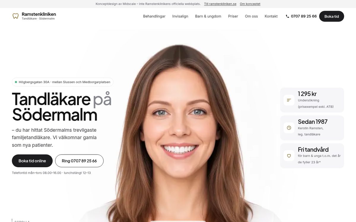
After: the same content, booking first. The portrait is an AI-generated model.
What the redesign keeps
Everything real. The clinic’s own sentences (“Vi tror på tandvård med omtanke och delaktighet…”), its nine treatments with their full descriptions, the Invisalign process step by step, the real prices, and all four staff members with their bios. The staff photos aren’t used, because the staff haven’t agreed to appear in my portfolio, so each card has a marked spot for the clinic’s own photos.
What’s new is the order. Booking, calling, prices and hours come first, and everything else supports that decision. The design decisions are in the case study.
Try this on your own site
Open your homepage on your phone in a private window and check four things:
- Can a stranger tell who you are, what you do and where you are in five seconds?
- Is the way to book or buy the most obvious button on the screen?
- Do your opening hours, prices and phone number match on every page?
- Is there anything on the site that isn’t true anymore?
Want this for your website?
This is what my $149 Launch Review covers. I go through your website the way a new customer would, then send you a recorded walkthrough and a ranked list of what to fix first. If you want the fixes designed and built, the $149 is credited toward a two-week Launch Sprint (your homepage plus one key flow, like booking; founding price $1,500 for the first five clients) when you book it within 30 days.
Not sure yet? Book a free 20-minute call, show me your site, and I’ll tell you honestly what I’d fix first.