Teardown: 8 fixes for an AI-built hiring tool’s landing page
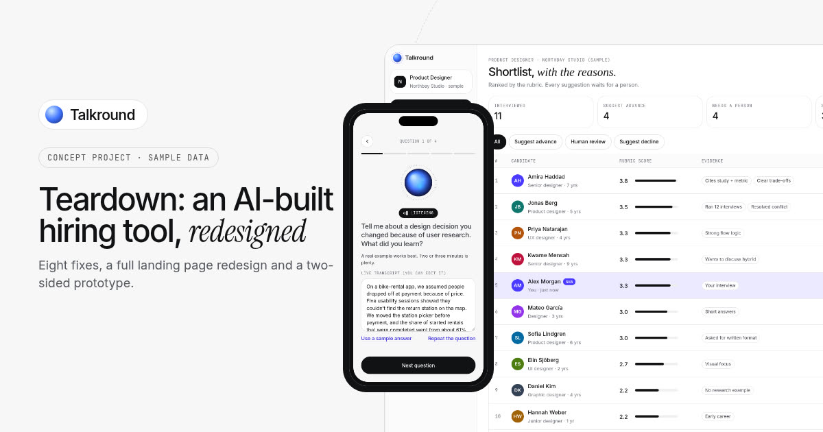
This AI hiring tool has a strong idea: candidates take a first-round interview with an AI, and recruiters get a ranked shortlist with a report for each person. The landing page makes it very hard to trust. It shows no product, its numbers disagree with each other, and its most prominent feature is one a careful buyer would run from.
I picked a real, live AI-built page, found eight things I’d fix, and redesigned it to show what fixing them looks like. If you’re building an AI product with Lovable, Bolt or Cursor, trust is your whole sales pitch, and I’d bet a few of these are on your page too.
A quick note on how this was made. Nobody hired me for this. It’s a self-initiated teardown of a public page, picked because it’s a typical AI-built SaaS site. I’ve blurred the brand in every screenshot, and I haven’t seen their analytics, so there are no “conversion went up 40%” claims here. The “after” is a concept with a made-up name, Talkround. I’m judging the page the way a head of talent seeing it for the first time would.
The page
It’s an AI interview tool for recruiting teams, staffing agencies and universities. Here’s the top of the homepage:
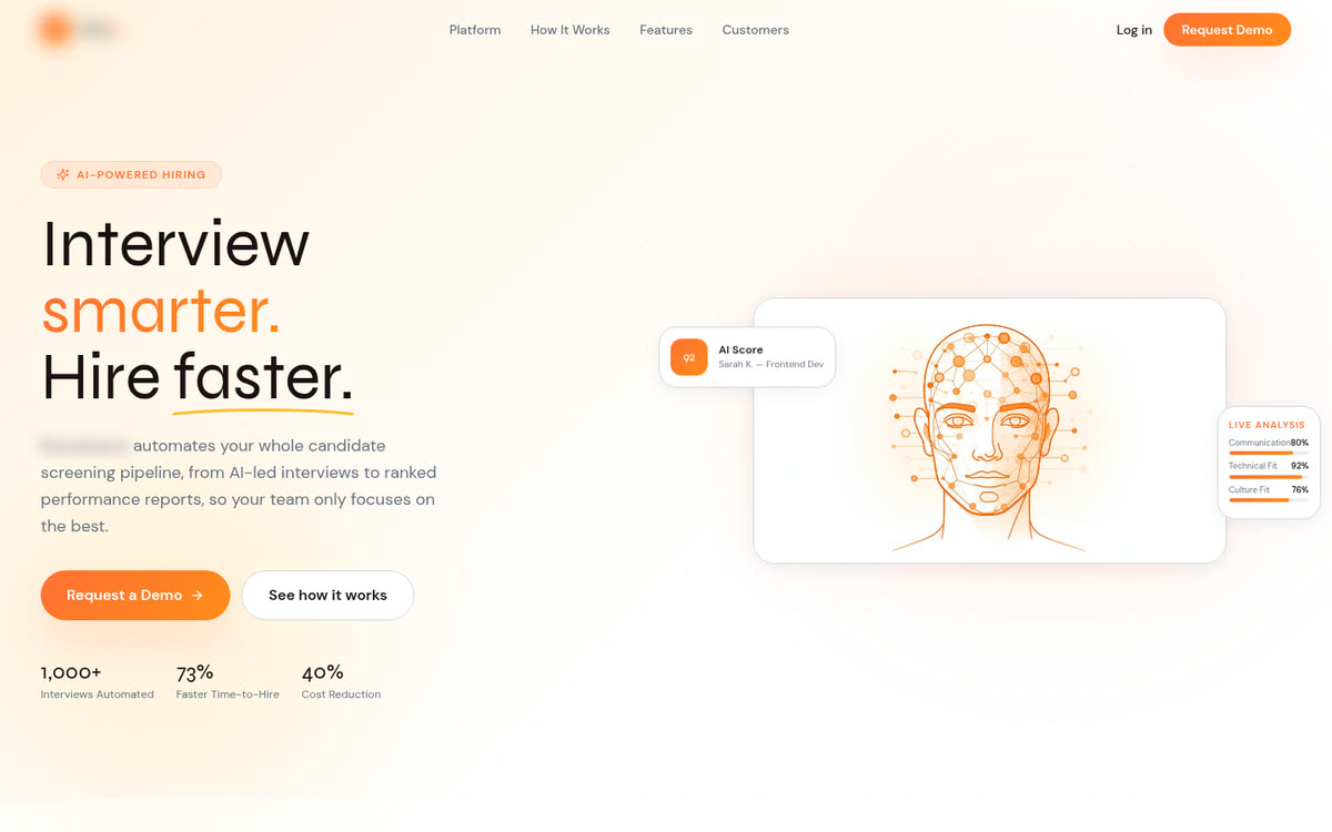
Before, desktop. Brand blurred.
1. There’s no product on the page
The hero image is an illustrated AI head made of dots and lines. Next to it, a small card shows “AI Score 92” for a candidate, and another shows “Live analysis” with Communication 80%, Technical Fit 92% and Culture Fit 76%. Further down, the feature list describes a dashboard, transcripts and PDF reports, but none of them are shown anywhere.
For a hiring tool, the screens are the proof. A recruiter wants to see what a candidate goes through and what lands on their own desk. Precise-looking percentages make it worse. Nobody can say what separates a 92% from an 89% “technical fit”, so nobody can defend it to a candidate or a manager.
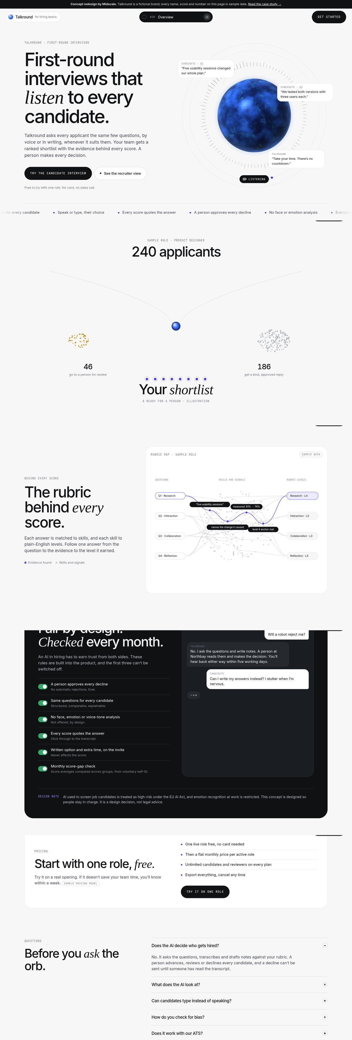
The fix: show the real interview and the real shortlist, and make scores explainable. The redesign opens with the interviewer itself, with short candidate answers around it. Below that, the product screens come from a working prototype, and scores are rubric levels from 1 to 4 that quote the words that earned them.
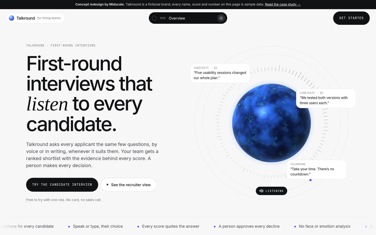
After: the interview is the hero.
2. The numbers disagree with each other
The hero says “1,000+ Interviews Automated”. A few sections down, the same number comes back as “1000+ Interviews per hour”. Those are very different claims. One is a total, the other is a speed, and a careful reader can’t tell which one is true.
The fix: every number on the page should appear once, mean one thing and come from somewhere. If two sections need the same figure, write it once and reuse it.
3. Results claimed before launch
“Results that speak for themselves” lists 73% faster time-to-hire, 40% cost saved and 94% recruiter satisfaction, with no source, sample size or date. The closing section says “Join forward-thinking companies using” the product. But the only way to sign up is a “Get Early Access” email form.
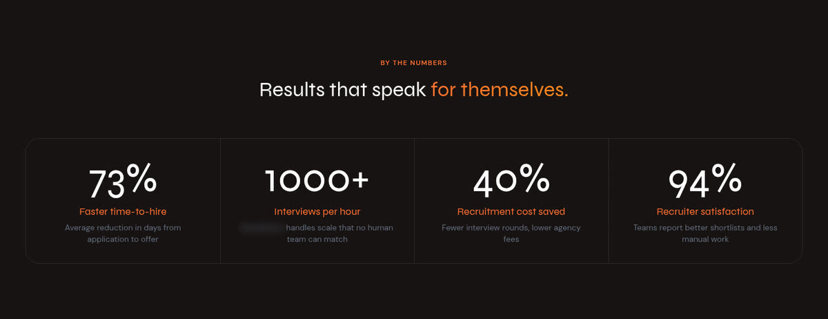
Four big results, no sources, on an early-access product. Brand blurred.
If you’re still in early access, those numbers can’t come from customers yet, and a buyer will notice. Once one claim looks made up, they start doubting the parts of the page that are true.
The fix: remove results you can’t back up. Being early is fine. Say what the product does, show it, and let people try it. The redesign has no results at all. Instead, a calculator estimates the screening hours a team could get back, with every assumption written underneath it, and it’s clearly labelled as an estimate.
4. Every button goes to the same form
“Log in”, “Request Demo” in the menu and “Request a Demo” in the hero all jump to the email form at the bottom of the page. A returning user who wants to log in ends up at an early-access form. Someone who wants a demo gets an email box and no idea what happens next.
The fix: make each button do what it says. If there’s no login yet, take the button out. If a demo is really a waitlist, call it a waitlist. The redesign’s main button opens the candidate interview right away, and the second one opens the recruiter’s view, with no sign-up needed.
5. A “Customers” link with no customers
The main menu has a “Customers” link. It scrolls to a section called “Built for every kind of recruiter”, which lists five types of user: enterprise hiring teams, staffing agencies, freelance platforms, universities and placement agencies. There are no customers in it.
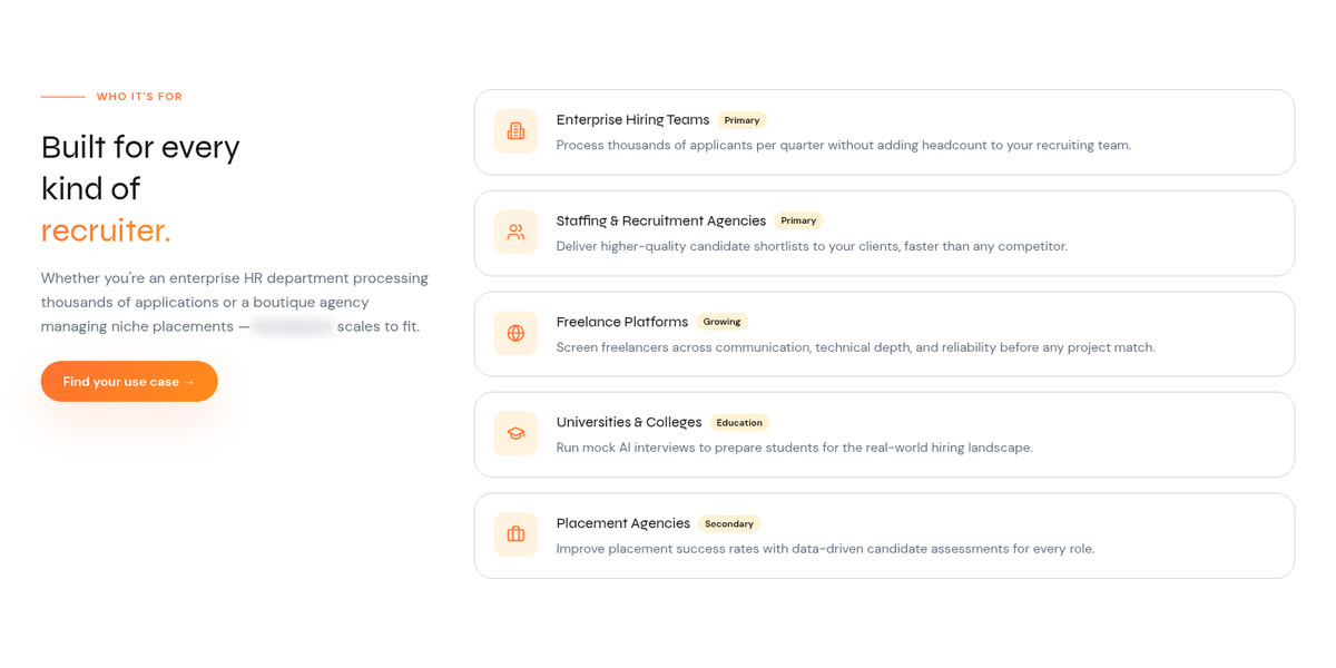
The section the “Customers” link points to. Brand blurred.
It also tries to serve everyone. Universities running mock interviews for students need a very different product from an agency screening hundreds of applicants.
The fix: name links after what they open, and pick one main audience. The redesign is written for in-house hiring teams and agencies screening lots of applicants, and it has no customer section until there are real customers who agree to be named.
6. Emotion detection as a selling point
One of the main features is “Face & Emotion Detection”: “Subtle emotional cues, confidence signals, and body language are captured and factored into evaluation.” Elsewhere the AI interviewer is described as “analysing tone”.
That’s a red flag for a lot of buyers. Reading emotions from faces and voices is widely questioned as a measure of anything job-related, and it can count against candidates who are nervous, neurodivergent, disabled or simply on a bad webcam. There’s a legal risk too. The EU AI Act treats AI used to screen job candidates as high-risk, and it restricts emotion recognition at work. I’m not a lawyer, and this isn’t legal advice, but a feature like this needs a careful legal review before it goes on a homepage.
The fix: remove it from the product and the page, and say so. In the redesign, the guardrails section says plainly that there’s no face, emotion or voice-tone analysis, and every score report lists what was not used for scoring.
7. The page never says who decides
The page talks about ranking and fit scores, but it never says whether a person makes the final call, or what happens to someone who is turned down. The questions also “evolve in real-time based on each candidate’s responses, resume, and job requirements”, so two candidates for the same job may not get the same interview, which makes their scores hard to compare.
For an AI that judges people, “who decides?” is the first question a buyer, a candidate or a works council will ask.
The fix: put a person in charge and show it. In the redesign, the AI suggests and a person decides. A routing diagram shows strong answers going forward, borderline ones going to a person, and declines that can’t be sent until someone has read the transcript. Everyone gets the same structured questions, and everyone hears back.
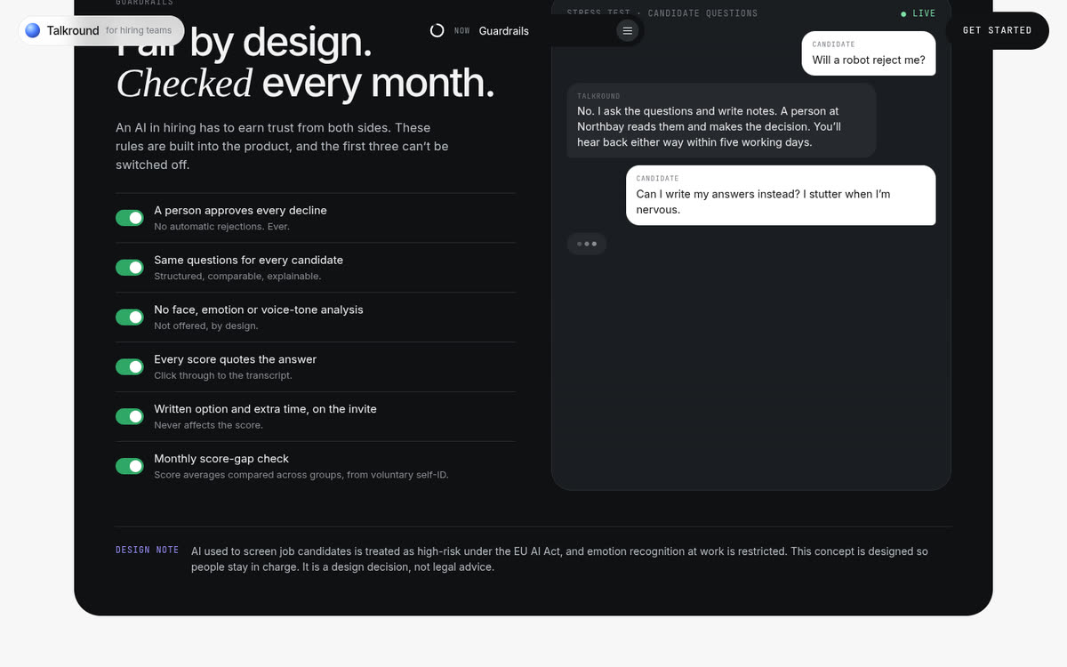
After: the guardrails, written for buyers and candidates.
8. The basics aren’t finished
Nineteen links in the footer go nowhere: every product, use-case and company link, the social icons, and the Privacy Policy, Terms of Service and Data Processing pages. On a page that asks for your work email, for a product that handles interview recordings, those three matter most. The browser tab still shows the app builder’s default title instead of the product’s name.
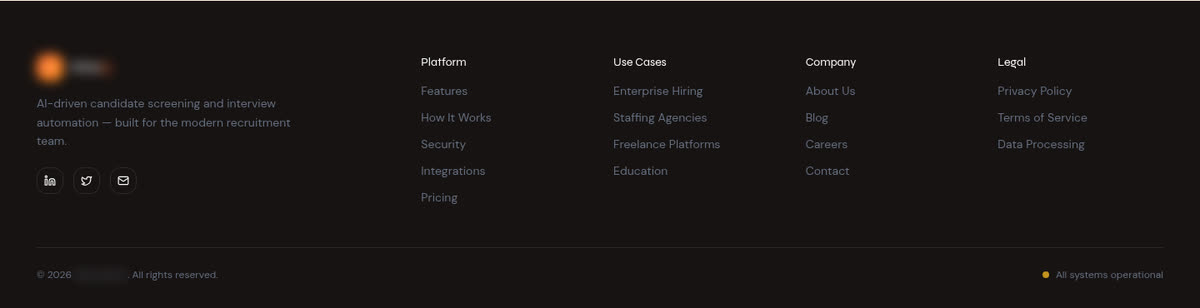
Every link here leads back to the top of the page. Brand blurred.
The fix: before launch, click every link on the page, and write a real privacy policy before you collect a single email. It’s a day of work, and for a hiring product it’s the difference between “early” and “not serious”.
On a phone
On a phone, the first screen is the slogan, a paragraph, two buttons and a stats row. The redesign fits a plain headline, a short explanation and both ways to try the product into the same space.
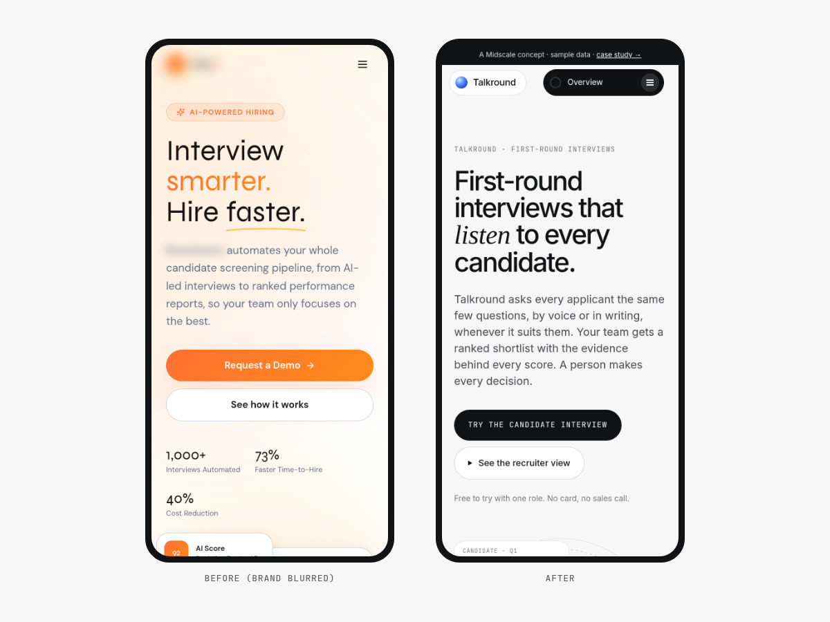
First screen on a phone: before (left, brand blurred) and after (right).
Want to click through it?
I took the redesign further and built Talkround as a two-sided clickable prototype. As a candidate, you get an invite that says how long it takes and who decides, choose to speak or type, and answer four questions with no countdown. Then you switch to the recruiter’s side and find your own interview in the shortlist, with a score report that quotes your answers. Declining someone needs a person to confirm they read the transcript. All of the product screens on the redesigned landing page are rendered from that prototype.
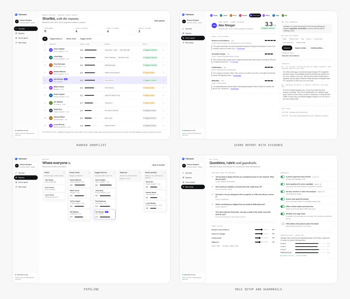
The recruiter’s side of the Talkround prototype. Sample data.
You can try it, and read the design decisions behind it, in the Talkround case study.
What this adds up to
The product idea here is a good one. But an AI that judges people has to earn trust from two sides at once, and this page asks for an email before it earns any. It hides the product, makes claims it can’t support, and leads with a feature that makes careful buyers nervous.
If you’re building an AI product, try this on your own page. Open it in a private window and ask four questions. Can a stranger see the product without signing up? Is there a number you couldn’t prove? Does it say who’s in charge when the AI gets it wrong? Does every link, including privacy and terms, actually work?
Want this for your app?
This is what my $149 Launch Review covers. I go through your landing page and app the way a new user would, then send a recorded walkthrough and a ranked list of what to fix first. If you want the fixes designed and built, the $149 is credited toward a two-week Launch Sprint (your landing page plus one key user flow) when you book it within 30 days.
Not sure yet? Book a free 20-minute call, show me your page, and I’ll tell you honestly what I’d fix first.