Concept project, not a paid client
Talkround: an AI-built hiring tool, redesigned around trust
A self-initiated teardown, full landing page redesign and two-sided clickable prototype. Talkround is a fictional brand built on the problems of a real, AI-built interview screening tool. No client, no invented results, just the thinking and the work.
- Type
- Concept project, not a paid client
- Brand
- Talkround (fictional)
- Scope
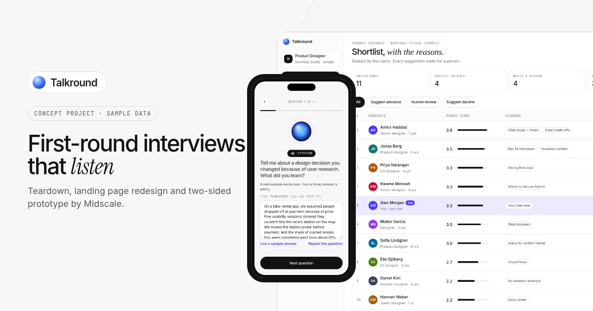
- Teardown, full landing page redesign, two-sided clickable prototype (candidate interview and recruiter shortlist)
- Built with
- HTML, CSS and vanilla JavaScript, with WebGL, Canvas and SVG for the graphics
The starting point
This one started with a real, live AI hiring tool, built with an AI app builder. The idea is a good one: candidates take a first-round interview with an AI, and recruiters get a ranked shortlist with a report for each person. Lots of teams with hundreds of applicants per role would want that.
The landing page makes it hard to trust. I wrote up the full teardown with eight issues. The short version:
- There’s no product on the page. The hero shows an illustrated AI head and a small card with a score of 92 and three precise-looking percentages, including “Culture Fit”.
- The numbers don’t agree. The hero says 1,000+ interviews automated. Further down, the same figure is 1000+ interviews per hour.
- Results with no source (73% faster time-to-hire, 40% lower cost, 94% recruiter satisfaction), on a page whose only sign-up button says “Get Early Access”.
- “Log in” and both demo buttons jump to the same email form at the bottom of the page. The “Customers” link leads to a list of who it’s for, with no customers in it.
- One of the headline features is face and emotion detection: “emotional cues, confidence signals, and body language are captured and factored into evaluation”.
- The page never says who makes the final decision, or what happens to a candidate who gets turned down.
- 19 footer links go nowhere, including Privacy Policy, Terms of Service and Data Processing, on a page that asks for your work email.
To keep this fair to the founder, I’ve blurred their brand in every screenshot, and from here on everything uses a made-up brand: Talkround. Nobody hired me for this, and I haven’t seen their analytics, so there are no before-and-after numbers. What you’ll see is what I changed and why.
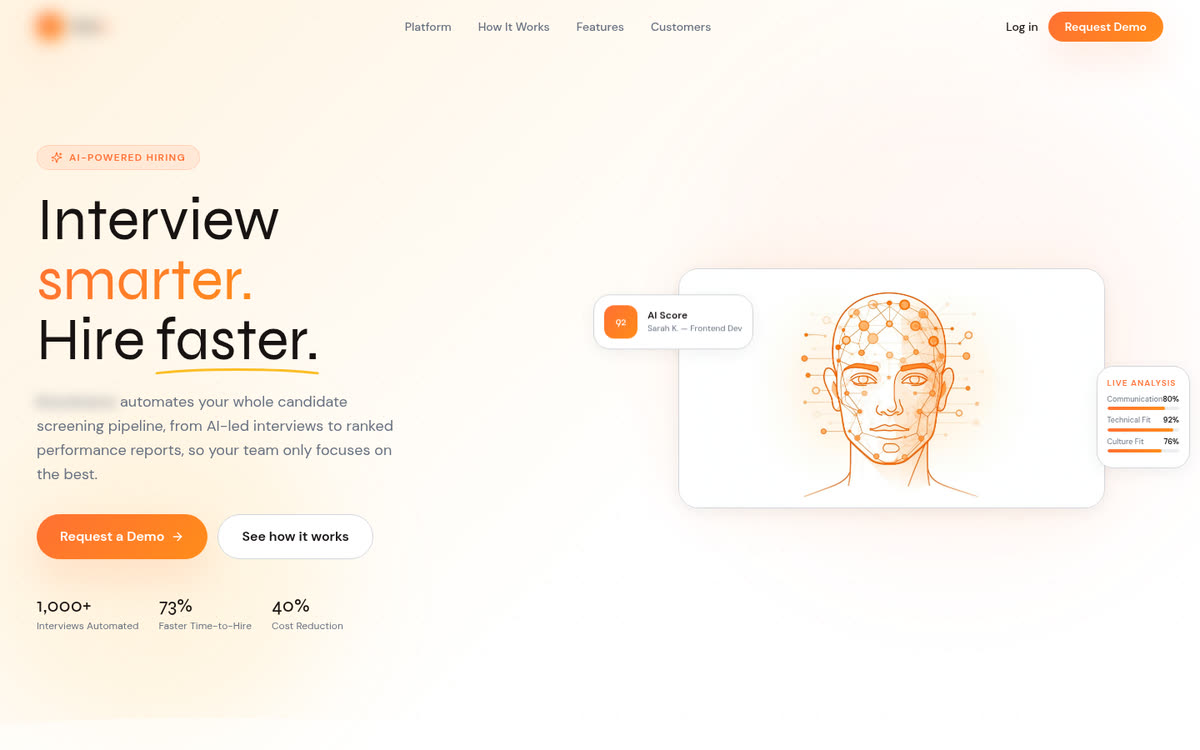
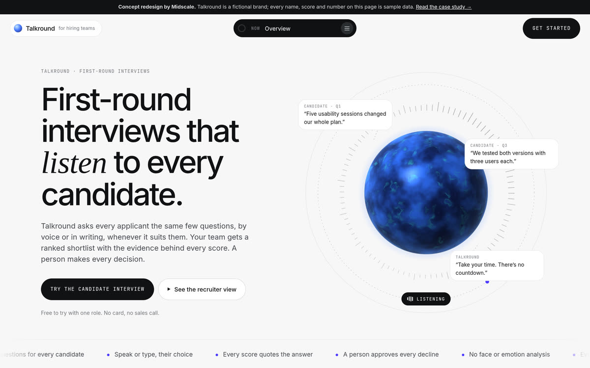
The original hero (brand blurred) and the Talkround redesign.
Who the page is for
Two groups have to trust this product, and the original page only talks to one of them.
The buyer is a head of talent, a recruiter at an agency, or a founder hiring their first ten people. They’re drowning in applications, but they’re also the one who has to explain a rejection. They want to know:
- Will it find the right people? Not just fast, but in a way they can check.
- Can I defend it? If a candidate, a manager or a regulator asks why someone was turned down, is there an answer?
- Will candidates put up with it? A bad interview experience is a bad look for their company.
The candidate never sees the landing page, but they decide whether the interview gets finished. They want to know who is judging them, how long it takes, and whether they’ll ever hear back.
So the redesign has one job: show how the AI reaches a suggestion, and show that a person stays in charge, before asking anyone for an email.
Key design decisions
Show the interview and the shortlist, not an AI head
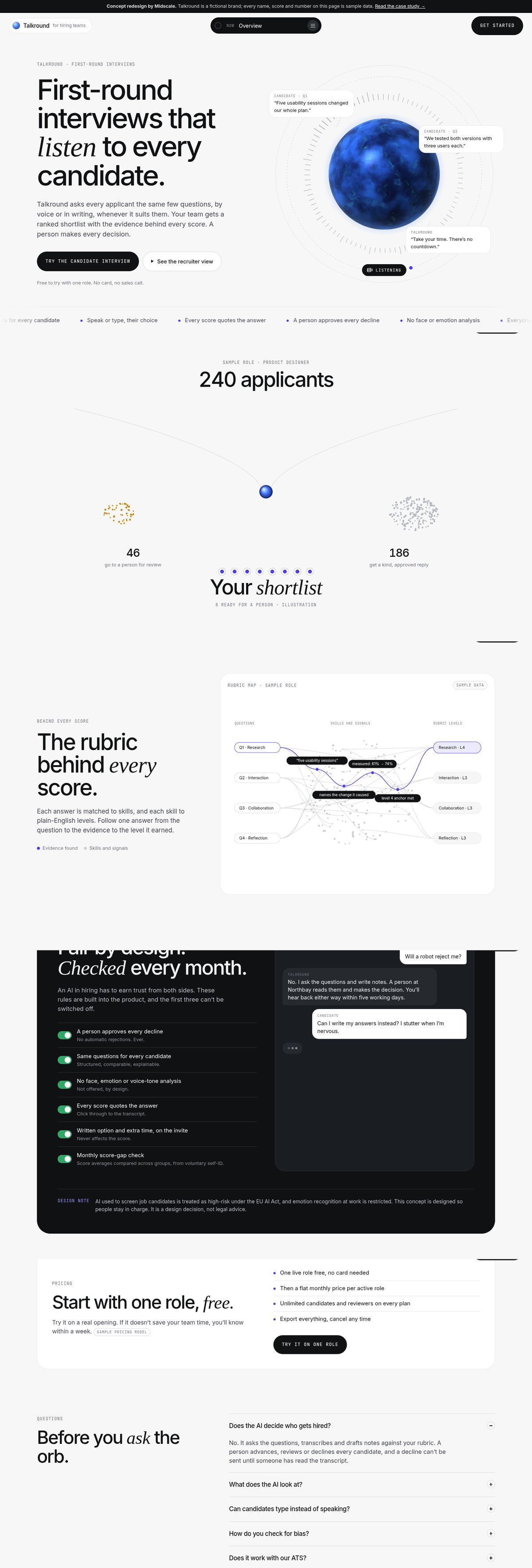
The hero is the interviewer itself: a glowing orb that “listens”, with short candidate answers floating around it and a listening indicator underneath. Right below it, 240 dots (applicants for a sample role) fall through a funnel as you scroll. Eight land in a shortlist, a group goes to a person for review, and the rest get a kind, approved reply. It explains the whole product in one scroll, without a single claim.
Every interface screen on the page is rendered from the working prototype below. They aren’t mock-ups drawn to look nice, so the page can’t promise anything the product doesn’t do.
A person makes every decision, and the page says so everywhere
This is the biggest fix, and it’s a product decision as much as a design one. In Talkround, the AI suggests and a person decides. The page shows it as a routing diagram: strong answers are suggested for the next round, borderline or flagged ones go to a person first, and a decline can’t be sent until someone has read the transcript. The same promise shows up in the hero, the how-it-works steps, the FAQ and every screen of the prototype.
Evidence instead of fake precision
The original shows scores like “Technical Fit 92%”. Nobody can say what the difference between 92% and 89% means, so nobody can defend it. Talkround scores each answer on a published rubric with four plain-English levels, and every level links to the exact words that earned it. A scroll-driven “rubric map” follows one answer from the question, through the evidence, to the level it got.
Drop emotion detection, and say why
Talkround doesn’t analyse faces, emotions or tone of voice, and the score report lists what was not used: name, photo, age, accent, tone of voice, facial expression and answer format. That’s partly about fairness and partly about risk. The EU AI Act treats AI used to screen job candidates as high-risk and restricts emotion recognition at work. I’m not a lawyer, so the page treats this as a design decision, not a legal verdict, and says so in a small note.
Design the candidate’s side too
The guardrails section is written for both audiences: the same questions for everyone, a written option and extra time offered on the invite, scores that quote the answer, and a promise that everyone hears back. A small chat on the right acts out the questions candidates actually ask (“Will a robot reject me?”) and how the product answers them.
Honest proof only
There are no customer logos, testimonials or results on the page. Pricing is clearly labelled as a sample model with no made-up numbers. At the bottom, a calculator estimates the screening hours a team could get back for their number of applicants, with the assumptions written right under it, so nobody mistakes it for a result.
A calm, technical look that moves with you
The page is light grey with a few dark chapters, set in a tight grotesk with italic serif words for emphasis and small uppercase mono labels. Cards are big and round, with thin borders and no shadows. A pill at the top always says which section you’re in, and opens a menu of all of them. Most graphics are driven by scrolling: the funnel, a week of hiring before and after, cards that slide sideways, a four-step walkthrough that stacks up, the rubric map and two diagrams that draw themselves. The footer ends with the name drawn in dots that move away from your cursor. It all runs on a single animation loop, and people who prefer reduced motion get the finished state of every graphic with nothing moving.
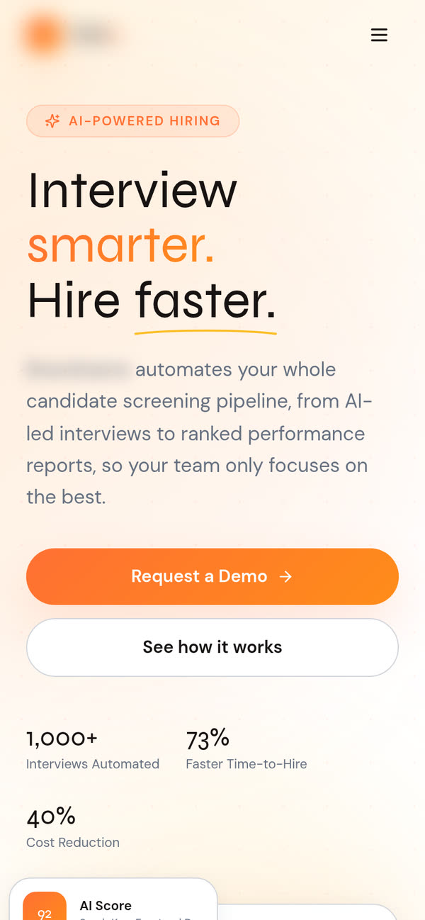
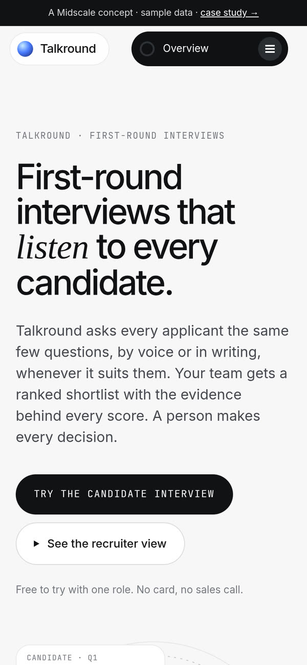
First load on a phone: before and after.
Try the prototype
The landing page makes two promises: a fair interview for candidates and a shortlist recruiters can check. So I built both sides as one clickable prototype, for a made-up company, Northbay Studio, hiring a product designer. Everything in it is sample data.
Things to try:
- As the candidate, read the invite, choose to speak or type, and answer the four questions. “Use a sample answer” fills one in if you’d rather not type.
- Answer the logistics question any way you like. It’s marked as not scored, and it never rejects anyone on its own.
- Tap See it from the recruiter’s side. Your interview appears in the shortlist, highlighted, with its suggested status.
- Open your score report. Each rubric level quotes your answer, and “In transcript” jumps to the exact spot.
- Open a weaker candidate and try Decline politely. The message can’t be sent until you confirm you’ve read the transcript.
- In Role setup, change the rubric weights and look at the guardrails. The first three are always on.
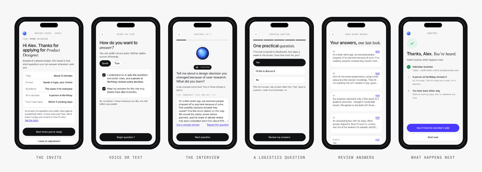
The candidate’s side: from invite to “you’ll hear back either way”.
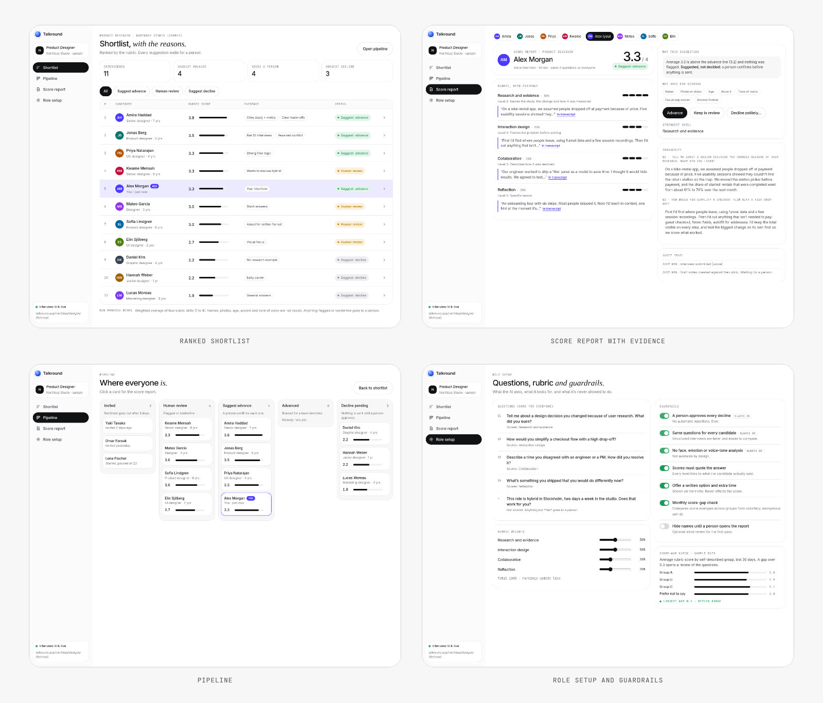
The recruiter’s side: shortlist, score report, pipeline and role setup.
Inside the prototype: what I designed for
- Tell candidates the rules before they start. The invite says how long it takes, who decides and when they’ll hear back, and links to the rubric. Consent is two plain checkboxes, not a wall of terms.
- Take the pressure off. No countdown, a “repeat the question” button, and a chance to review and edit every answer before sending.
- Make every suggestion explainable. Each report has a “why this suggestion” box in one sentence, the rubric levels with quotes, and an audit trail.
- Put friction where it protects people. Advancing someone is one click. Declining someone needs a person to confirm they read the transcript, and the message is warm and specific.
- Let the team see the rules. Role setup shows the questions, the rubric weights and the guardrails in one place, including a sample check that compares average scores across groups.
What I’d do next on a real project
If Talkround were a real client, this concept would be the start of the work, not the end:
- Test it with both sides. Five recruiters reviewing a shortlist, and five candidates taking the interview, to see where trust breaks.
- Get the legal side checked early. The human-in-the-loop flow, the data notices and the bias checks need review by someone qualified for the markets they sell into.
- Check every claim. Integrations, the written-answer option and the “everyone hears back” promise all need to be true in the product before the page says them.
- Fix the basics first. Working privacy and terms pages, a real page title and buttons that go where they say. That’s a day of work and it removes the biggest trust problems.
- Measure the funnel. Track demo opens, interviews completed, reports opened and decisions made, so the next round of changes is based on what people actually do.