Your landing page is the first interview your product ever does
Your landing page is the first interview your product ever does. A buyer gives it a few minutes, asks themselves whether they trust it, and leaves if the answer isn’t clear.
In my last post I showed the candidate side of Talkround. This is the other half: the page a buyer sees first.
The page I started from
The original is a real, live AI interview tool built with an AI app builder. Its landing page sells the product with a slogan, an illustrated AI head and a row of results: 73% faster time-to-hire, 40% cost saved, 94% recruiter satisfaction. None of them has a source, and the only way to sign up is an early-access form. It’s all in the full teardown, with eight fixes.
An AI that judges people can’t sell itself on a slogan. So I rebuilt the page as Talkround, a concept with a made-up name, to explain the product as you scroll.
What the page shows, chapter by chapter
The interviewer comes first. The hero is the product: a listening orb with short candidate answers around it. The two buttons open the candidate interview or the recruiter’s view straight away, with no sign-up.
The funnel. 240 sample applicants fall through a funnel. Eight land in the shortlist, and the rest go to a person for review or get a kind, approved reply. It’s labelled as an illustration.
The rubric map. One answer is traced from the question, through the evidence in it (“five usability sessions”, “measured: 61% → 74%”), to the rubric level it earned.
Routing. Every interview goes somewhere sensible. Strong ones are suggested for the next round and a person confirms. Borderline or flagged ones go to a person first. A decline is sent only after someone reads the transcript.
Guardrails, switched on in plain sight. A person approves every decline. Everyone gets the same questions. There’s no face, emotion or voice-tone analysis. Every score quotes the answer. The first three can’t be switched off.
A calculator that admits it’s an estimate. Move the slider and it estimates the screening hours a team could get back. Every assumption is written underneath, and it says plainly that it’s an estimate, not a result.
There are no stock AI illustrations and no mystery percentages. It’s just the product, showing its work.
The full redesign, liveScroll the full landing page redesignYou can open it on its own and scroll through every chapter. It’s best on a laptop.Open the landing page →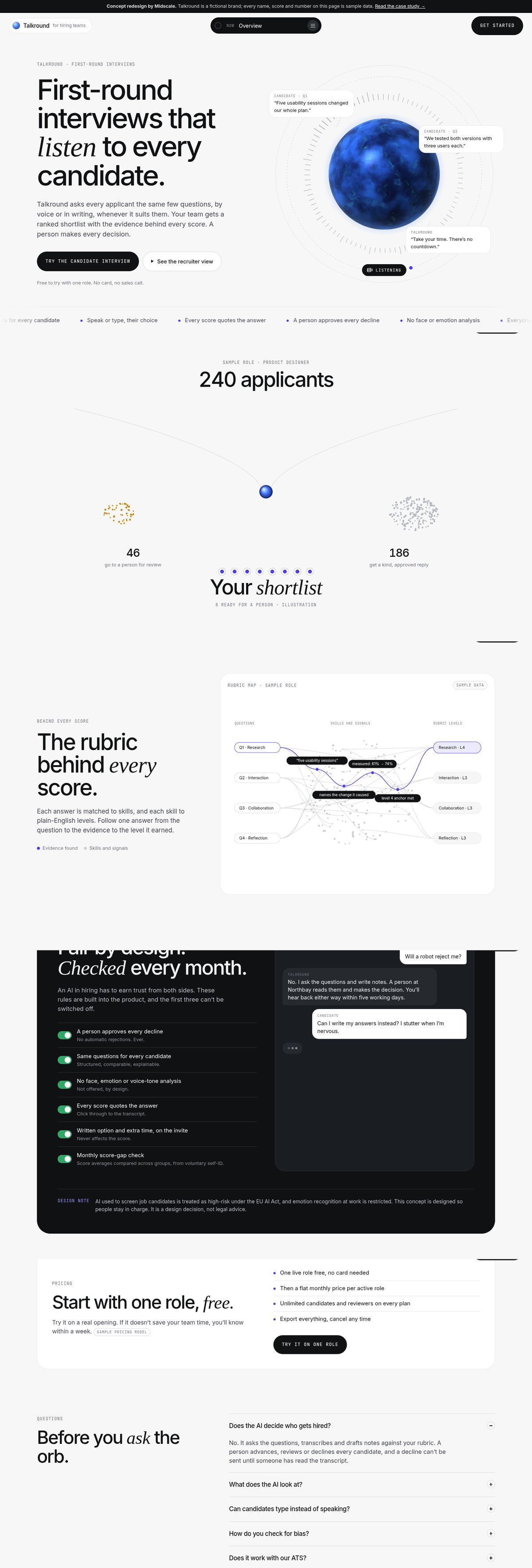
What to take from this for your own page
- Show the product. If a stranger can’t see it without signing up, you’re asking them to trust a slogan.
- Cut every number you can’t source. Being early is fine. Results you can’t back up make buyers doubt the true parts too.
- Say who’s in charge when the AI gets it wrong. For anything that judges people, it’s the first question a buyer will ask.
- Explain hard ideas by showing them working. One chapter at a time beats another paragraph of adjectives.
Every interface screen on the Talkround page is rendered from the clickable prototype, so the page can’t promise anything the product doesn’t do. The design decisions are in the case study.
Make sure your first interview passes.
Want a second pair of eyes on your page?
Book a free 20-minute call, show me your landing page, and I’ll tell you honestly what I’d fix first.